Changes to your wireframe layout – especially when they appear at the top of the email in the before-your-recipients-scroll view – can have an impact on your performance.
I’ve written about best practices for images in your email message – here’s an A/B split test that focuses on the best way to include an image with copy in your before-they-scroll view.
As always, don’t just take these case study test results and apply them to your own program – do your own testing to see how your email subscribers respond to different wireframe layouts.
Case Study: Testing Wireframe Layouts
Background
This was a brand-new email; we wanted to do an A/B split with the first send to determine which treatment of the top image and opening copy would be most effective at driving revenue.
We had big plans for this email (more on that in a later blog post) so it was important that we optimize it from the start. I know from experience that the ‘above-the-fold’ or ‘before-they-scroll’ view of the email is your chance to engage the reader – or not. So we decided to focus this first test in our first send on optimizing this section of the email message.
Test Set-up
We’ve had a lot of success with layouts where the top image is half-width, with a headline or copy next to it, rather than a full-width image with copy above or below.
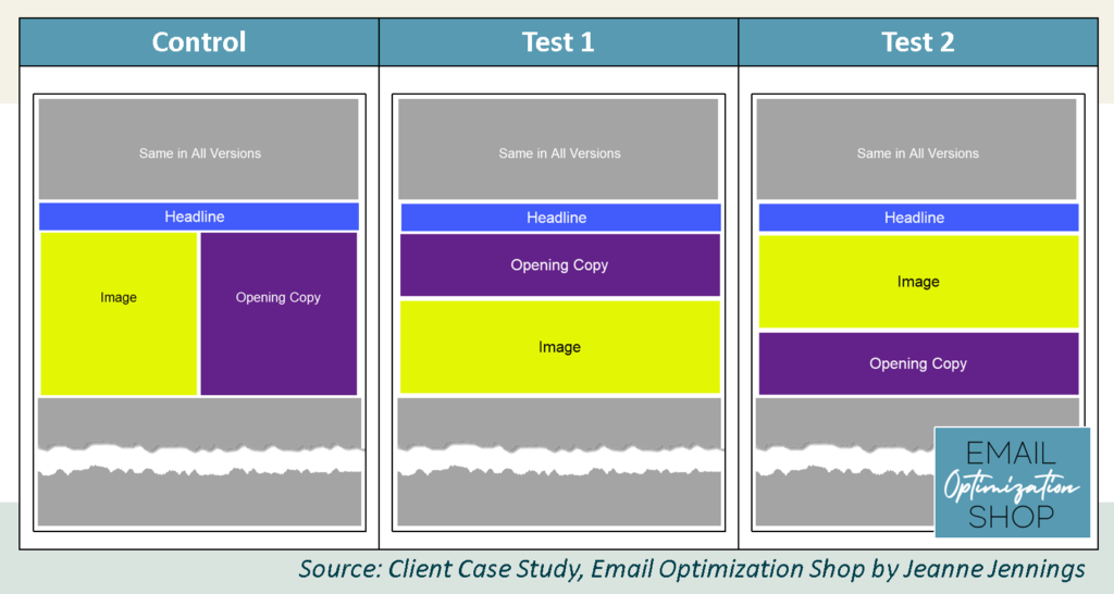
Using that as a starting point, we created the control version of this test which you see on the left below. We put the headline at the top, the image on the left, and the opening copy on the right. The opening copy consisted of a sub-headline and 2 short paragraphs about the benefits of doing business with my client. You can see it at the left below.
You’ll see that there was headline in this email; we kept it at the top, just below the standard header, for all versions.
For Test 1, we moved the opening copy above the image. You can see that version in the middle below. As discussed, we kept the headline above both the opening copy and the image.
For Test 2, we moved the opening copy below the image. That’s the version on the right below.
As always, we kept everything except the elements mentioned above the same, so we could get clear results.
We split the list randomly into three groups, one to receive the control, one to receive test 1 and one to receive test 2. Each group had more than 150,000 email addresses in it. This is well above my minimum cell size of 20,000, which almost always allows me to get statistically significant results. See the split below.
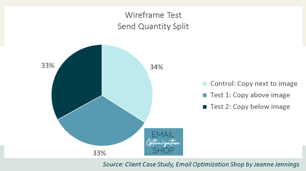
As you can see, 34% of the list received the control version (copy next to image); 33% received the test 1 version (copy above image) and 33% received the test 2 version (copy below image).
Which version do you think won? Was it the control version with the image on the left and the opening copy on the right? Or test 1 where the copy was above the image? Or test 2 with the copy beneath the image?
I’ll give you a minute to think about it… then scroll down to get the answer.
Results
Here are the results!
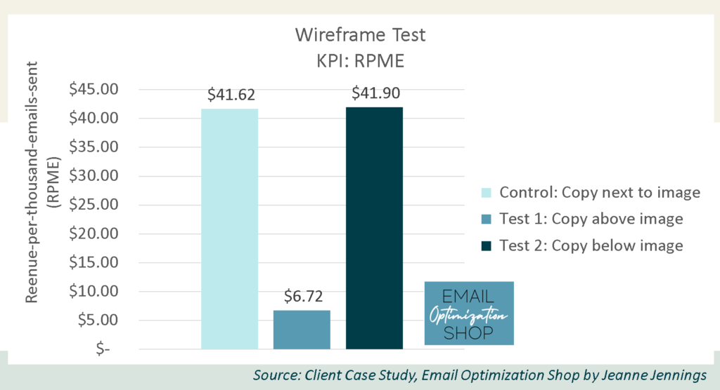
The control (copy next to image) and test 2 (copy below image) finished in a dead heat, with revenue-per-thousand-emails-sent (RPME) at just under $42 for both. The variance between the two is within the margin of error.
The version with the copy above the image trailed the other two significantly.
How many of you guessed correctly?
Our key performance indicator (KPI) here is revenue-per-thousand-emails-sent (RPME), because we are looking to optimize revenue.
Note: We used RPME instead of revenue-per-email (RPE) because the RPE numbers were small. By increasing the magnitude it makes it easier to see variances – and the relative variance between the cells remains the same.
Here are the full results.
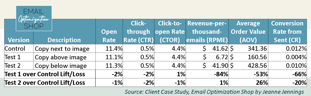
As you can see, the variance in RPME between the control and test 2 was just 1%, which puts it within the margin of error. This means that there is no statistically significant difference between the two.
Typically in these cases you stay the course; you declare the control the winner and move on. But this situation was a little different, since all three of the versions were brand new. The control was the control not because it was historically successful, but just by chance.
So how did we determine which to declare the winner and move forward with?
We took a look at the other metrics to help break the tie.
We started with the other business metrics average order value (AOV) and conversion rate from sent (CR).
Test 2 bested the control in AOV by 26%; nearly $429 for test 2 compared to just over $341 for the control. But test 2 lagged the control by 20% in CR; 0.010% for test 2, compared to 0.012% for the control.
We made the call based on which of these secondary business metrics had the largest variance – so we went with test 2, where the copy was below the image, as the winner and our new control for the next send.
While it doesn’t factor into success or failure, looking at your diagnostic metrics can sometimes give you ideas for other elements to test.
The diagnostic metrics for all three versions were pretty much the same; all were within the margin of error.
- Open rates ranged from 11.1% to 11.4%, no more than a 2% variance
- Click-through rates (CTRs) all rounded to 0.5%, again with no more than a 2% variance
- The click-to-open rates (CTORs), which are metrics calculated from the open rates and click-through rates, also all came in at 4.4%, with no more than a 1% variance between them
This is more support for not using CTR as your KPI; if you had, this test would have been a three-way draw and you might have chosen to move forward with test 1, leaving a lot of money on the table in future sends.
Were we surprised by the result?
Yes. Usually when I test a full-width image at the top versus a half-width image, the latter wins. So this was a surprise. It was also a surprise that the version with the copy below the image, not above it, did the best.
This is why we test. Because no matter what we find more pleasing to the eye, no matter what we’ve seen work in the past, what the audience thinks at this moment is what really matters.
Take-aways
So, does this mean that all your email templates should have a headline first, then a full-width image, then opening copy?
No.
I believe that the headline made the difference here. The Headline was compelling enough to pull people in; I think we would have had very different results without the headline.
It’s important to hypothesize about what might have impacted your results, win or lose.
Have you tested your above-the-fold wireframe? If not, this is your call to do so! Give it a shot and let me know how it goes!
And if you’re just too busy to do testing like this, take a minute and reach out to me. I’d love to learn more about your program and discuss how I can help you boost the bottom-line performance of your email marketing initiatives.
Be safe, stay well,


Photo by Kelly Sikkema on Unsplash