Most email messages sent today include images. But are you using the right images? And are you using them effectively? Are there things you could do to boost bottom-line performance?
Here are some tips, based on best practice and my 20+ years helping clients make their email marketing more effective and more profitable. As always, you should A/B split test into any changes to your own email marketing.
Images can make an email marketing message more appealing. And if you’re selling a visual product (read: clothing, furniture, artwork, etc.) you pretty much have to include the image to motivate your reader to buy.
But in many email messages I see the images don’t add any value – and sometimes they actually detract from the purpose of the message.
Here are 6 tips for making better use of images in your email messages.
1. Don’t Use a Full-width Hero Image at the Top of Your Email
I love hero images on websites. In email messages, not so much.
You see, many email clients still blog images by default. So if you have a full-width hero image at the top of your email message, it won’t appear if images are blocked. And it won’t ‘roll up’ so that the copy beneath the image appears in the preview pane. It will just leave a big blank space. See the example at the left below.
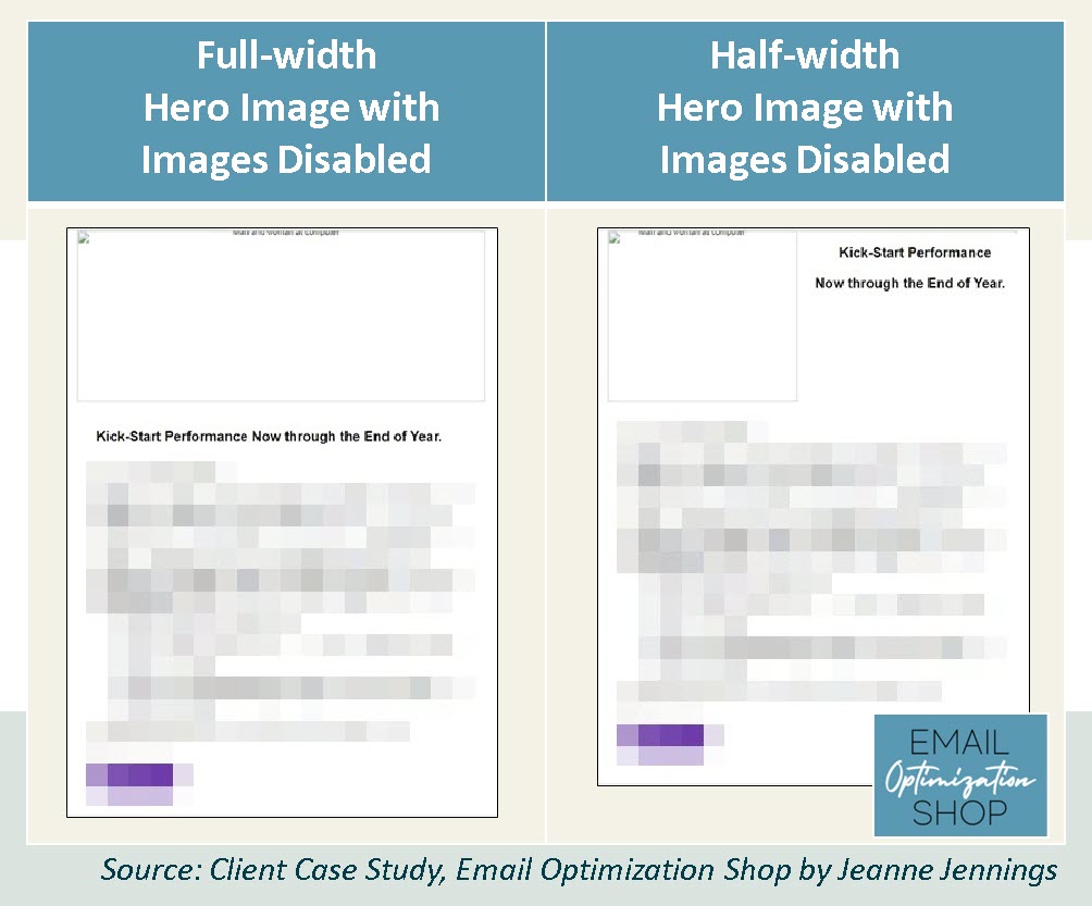
I often test half-width images against full-width hero images to see which performs better; the half-width image with rich text copy next to it (at the right above) almost always wins.
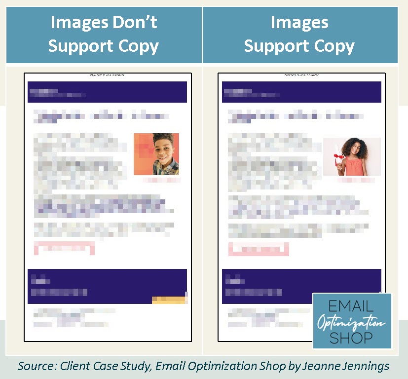
2. Images Should Support the Copy
If you’re selling a visual product, then the image is critical. But many emails aren’t selling visual products; in these instances, the image should support the copy.
The email below presents a case study where a teacher gave certificates to each of her students – the original email, on the left, includes an image of a child smiling. This is fine, but it doesn’t truly support the copy. Now look at the same email with an image of a child holding a certificate, which appears on the right. This image better supports the copy.
3. Make Your Images Authentic
Stock images look like… well, stock images. The trend in the last few years has been to use more authentic images, and a lot of sites have sprung up to meet this need. In many cases the more authentic images are free or less expensive than traditional stock photography. Here’s an example.
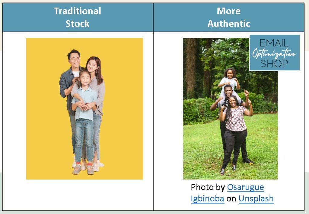
One of my favorite sites for authentic imagery is unsplash.com. They have many images available at no charge and you can update to ‘Unsplash+’ for a small fee.
4. If You Want Recipients to Read It, Don’t Embed It In An Image
Too many companies put copy they want recipients to read in images. Sometimes it’s so that a non-standard font can be used; other times it’s just to make the copy ‘prettier.’
See the example below. It’s a little difficult to see since I had to blur out the details, but when images are enabled you see the logo, some copy, and the phone number to call – the image on the left. The view with images disabled appears on the right – the logo, copy, and phone number are no longer visible.
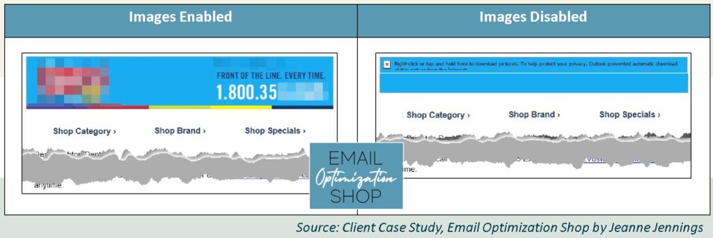
This is an extreme example – you should never make any copy you want read part of an image, let alone your key call-to-action.
The same goes for your call-to-action buttons. They should be colored cells in your table with rich text on top, not images.
5. Don’t Send All-Image Email Messages
These had almost become extinct, but in recent years I’ve run across companies that are doing it again.
The email may be a single large image – or it may be a large image that’s been sliced into pieces to allow for clicks on different areas to direct readers to different landing pages. Either way, it’s not a good idea.
When images are blocked your all-image email will look something like what you see below.
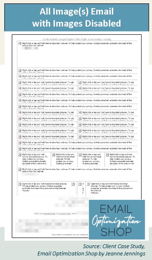
Copy is king in email. Be sure your email has enough to make your case if images are disabled.
6. Make your Images Clickable
People will often attempt to click on images in an email. Don’t disappoint them. Every image should support the key message of your email – and as such, if a reader clicks on it they should be taken to a landing page that furthers your goal. This is especially true of logos which appear at the top of your email message – use them to send those who click to a page that moves them toward the action you want them to take.
In Closing
So that’s it. Six simple tips for making the images in your email marketing efforts more effective. Test them with your email marketing and let me know how it goes. Or call me and let’s discuss how I can help.
Did you enjoy this post? It’s one in a series; earlier posts covered:

Photo by Markus Spiske on Unsplash