How effective is your online email sign-up?
Here’s a case study showing how simple, inexpensive changes to a client’s sign-up page took it from less than a 10% conversion rate to a 45% conversion rate, a 350% boost.
Read on to see the issues I identified on their original page and how we addressed them in the revised page that boosted performance.
I’ve written about the “honeymoon effect” — the fact that subscribers who recently opted in to a list open and click more than those who have been with you for a longer period of time. As a result, the more new opt-in subscribers you add each month, the higher your overall open and click-through rates will be – and the healthier your list.
Opt-in is the keyword here. You won’t necessarily get these results if you’re adding names to your list without permission. You’ve probably got an email opt-in on your website already, which is good. Today we’re going to talk about small changes to it that can dramatically increase your monthly list growth.
This case study is based on work I did for a B2C newsletter, but the results can be applied even if you’re B2B and aren’t offering a newsletter (but if you aren’t, you should see my column on the value of including editorial content in your email mix).
I always start with the numbers. Looking at the website analytics, I learned that 91% of the people landing on this sign-up page did not go on to the “thanks for signing up” page – meaning that they didn’t complete the newsletter sign-up. That’s nine out of 10 people that were interested in getting the newsletter but abandoned the page without opting in.
Further analysis showed me that:
- 19% of the visitors exited the site from this page
- 72% clicked from this page to visit other pages on the site instead of completing the sign-up
Website exits suggest that the visitors didn’t find what they were looking for on this page, that the promise made in the call-to-action that got them there was not fulfilled. It’s also frustrating to see website exits – it means that someone who was “this close” to signing up for the newsletter left and may never return to the website.
The visits to other pages tells me that there are distractions on this page, distractions with links that are pulling people away from this sign-up page and back into the site at large.
When I looked at the sign-up page (a wireframe of the original page appears below), the creative supported what the analytics were telling me.
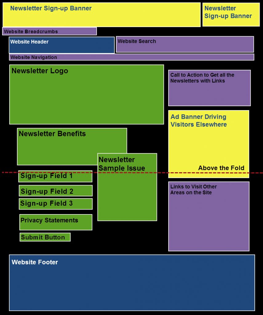
When people land on this page, the portion of the page “above the fold” is what appears in their browser. While people scroll a lot more than they used to (when the World Wide Web was a new experience for people), their willingness to scroll to look for content is directly proportional to their interest in finding it.
I never want to count on people being so dead set on finding my content that I make them scroll for it. But that’s exactly what the original page did.
Look at where the sign-up fields appear – just below the fold. This is the most important part of the page, but it doesn’t appear in the prime real estate, which is above the fold. Roughly 10% of visitors were interested enough to scroll to find these fields – but over 90% weren’t.
Now look at what does appear above the fold, in the page’s prime real estate: much of the content is advertisements (in yellow on the wireframe).
Advertisements have no place on your sign-up page. Ads are created to grab the viewer’s attention and, usually, get them to click to a different page to learn more. This is in direct conflict with your goal for this page – to get visitors to provide their email address and other information and click to get on your email list. If you have advertisements on your sign-up page, you are potentially shooting yourself in the foot!
Notice that both of the top ads were promoting the email newsletter that you can sign up for on this page – the call to action is to click through to sign up. Visitors to this page probably got here by clicking on one of these banners on another page. And if they click on one of these banners here, the page will refresh and they’ll see the same thing. This is at best silly and at worst confusing for visitors; it’s not a good experience.
Next let’s look at other places on the page where people have the ability to click and go elsewhere (purple on the wireframe).
While I’m a big fan of search, breadcrumbs, and navigation, they don’t belong on your sign-up page. They are distractions from the task at hand, just as the ads are. Suppress them here and then show them again on the thank you page, after the visitor has completed the sign-up.
There were two other purple boxes on the original page that needed to be addressed. The first was at the top right. This particular client is a large organization and they offer multiple email newsletters. Each has its own sign-up page and this box featured the name of the other newsletters with a link to sign up. This can be very confusing for visitors and drive them to click through and leave the page for the newsletter they wanted to sign up for.
At the bottom of the right column there’s another box with links to other sections of the website. This is one more temptation that can cause people to click away from this page without filling out the form.
This is the first step to improving your sign-up performance – identifying and closing exits.
Now let’s talk about how we revised the wireframe for the page and made other tweaks which resulted in conversions going from less than 10% to 45%, a 350% increase.
After reviewing the content and determining what needed to be removed, it was time to build a wireframe for the revised page (below).
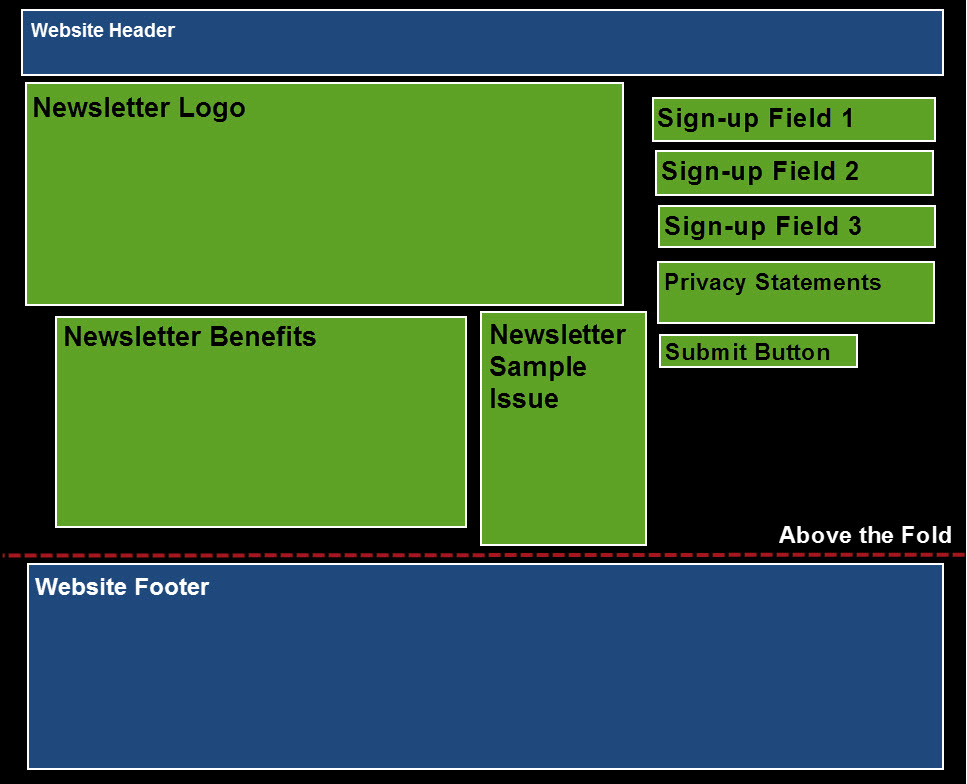
Notice what’s missing? As we discussed earlier, we’ve removed all of the advertisements and items with links to take people to other pages on the website. The list includes:
- Two advertisements that appeared above the website header
- The website breadcrumbs that were above the header
- The website search box that appeared next to the header
- The website navigation bar that appeared under the header
- A box with links to other newsletter sign-up pages that had been at the top right
- An advertisement that was in the middle of the right column
- A box with links to other sections of the website that appeared at the bottom of the right column
Now that we’ve freed up space, I moved some of the other items around a bit to optimize the page.
The newsletter logo, benefits, and sample issues pretty much stayed put. All were above the fold on the original page and we’ve kept them there. I did look at making the newsletter logo smaller, but it is actually a montage and didn’t look like much when we minimized it. So we kept it the same size.
The biggest change here is where the fields, privacy, and submit button appear. These are the most critical elements of the page, the items that keep the promise made in the call to action that people clicked on to get here. I’ve given them a prominent location at the top right of the page.
Notice also where the above-the-fold line falls now. By removing the extraneous content (content not directly related to the email sign-up), we were able to get all elements of the page above the fold. Visitors no longer need to scroll, unless they want to view the page footer.
One thing I want to mention that you can’t see here are the copy changes I made.
I revised the newsletter benefit copy and bullet points to be more benefit-oriented. This is something that many email marketers overlook. Although sign-up is free, getting people to sign up is still a marketing exercise. The benefits of having an email relationship with you (in other words, what’s in it for the subscriber) are critical to getting the sign-up.
I also changed the terminology on the button below the fields. On the original page, the button said “Submit” – on the revised page I changed it to read “Sign Up.” Is this a small thing? Yes. Would this change alone cause a dramatic increase in conversion rate? Likely not. But your website and the copy on your website reflect on your brand. “Submit” is a rather cold word; “Sign Up” or “Join Now” are softer, friendlier ways to say the same thing.
I also want to say a few words about the sample issue. Offering visitors a chance to see an issue of the newsletter before they sign up has shown to increase conversion rates. But it’s important to do it right. The sample issue here opens in a daughter window. That’s a new browser window that appears in front of, but does not completely cover, the existing page. The links in the sample are not clickable – it’s just an image of the email. This is very important, as these links would be exits that could take people away from the sign-up page.
So how did we do? The client saw a dramatic increase in list growth overnight by making these simple, inexpensive changes. Conversion rate went from just under 10% to 45%, right away. And it’s stayed at that level.
Best of all, this is just the beginning. Now that basic optimization of the page has been done, we can start testing other things, both on this page (to increase its conversion rate) and on the calls to action leading to this page (to drive more traffic). The sky’s the limit!
So now it’s time to take a look at your sign-up page. Start with your website analytics to see what your conversion and abandon rates are currently. Then critique your page to see what you can do to deliver on the promise of the call to action, close the exits, and boost your list growth rate!
Note: I originally wrote this case study post back in 2012 and it was published by Click; it is based on actual work that I did for a client.