You know the ‘conventional wisdom’ that short emails perform better than long ones? It’s not always true.
Read on to learn how we dramatically increased traffic from an email to the website by taking a strategic approach to increasing the length of the message.
One website, thousands of items for visitors to choose from, a monthly email sent by a partner featuring one item. When we starting doing these we wanted to keep it simple. We wanted to keep it short. And it worked pretty well. The wireframe for the control email appears below.
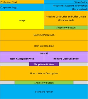
1 Item Featured (purple)
But you know that I’m mad for performance testing. I’m always brainstorming hypotheses for ways to boost the bottom-line.
Each month we’d try to figure out which one item would resonate with the audience and drive the most traffic back to the site. But I got to thinking: Why not take a different approach? Why not test featuring more than one item?
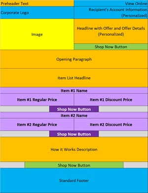
Test Email A Wireframe:
2 Items Featured (purple)
Here’s my hypothesis: by featuring a variety of products, we increase the chances of people who open the email finding one that engages them enough to click-through to the website.
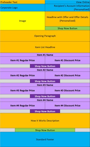
Test Email B Wireframe:
4 Items Featured (purple)
We didn’t choose just any items — we looked at the items the partner was featuring on their home page and used those in the email. We didn’t know, but we assumed that these were the most popular items on the site (otherwise why would they be featured on the home page?).
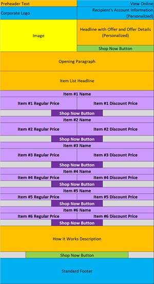
Test Email C Wireframe:
6 Items Featured (purple)
So that’s the set-up. We tested including two items, four items and six items against the single item control — the wireframes for each appeared above.
We made sure that the first item was the same for all. And everywhere there’s a second item that’s the same for all the emails. And so on. So each each email starts with the items on the previous email and just adds one or two more items.
So, which email motivated the highest percentage of openers to click-through to the site? Take your guess, then read on to get the answer…
Ready
for
the
answer?
The four and six item emails motivated the largest percentage of openers to click-through to the site. The data follows.
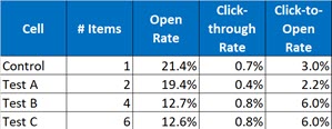
Let’s start from the right and work our way down. We used click-to-open rate (CTOR) as a proxy for unique site visits — they are, in reality, one and the same. Each individual who clicks ends up on the partner’s site. There’s another reason we used CTOR which I’ll discuss in a bit.
The control version, with a single item, drove 3% of openers to the site.
The two-item version, Test A, under-performed all other iterations. This is interesting. If you compare it to the control, a theory is that increased choice (two items instead of just one) created a paralysis in openers which depressed performance.
Not only is the CTOR on Test A roughly two-thirds of the CTOR for the control, the click-through rate (CTR), which is calculated out of the quantity sent, is also only about 60% of what the control generated. Remember — the first item in each email is the same. So fewer people clicked on this link when a second item was introduced.
If we had stopped here, if we had just tested two items versus one item, the control would have won and we would have continued to feature just one item a month.
So it’s good that we tested four and six items. Because here we saw a dramatic lift.
The performance of the four and six item versions, Tests B and C respectively, was remarkably similar. Both showed a dramatic lift in the CTOR — 6% versus 3% for the control, a 100% lift.
Here the hypothesis holds — that providing more choices increased the chance that people would find something to engage them enough to click-through.
So what’s our new control? The four item version. It performed the same as the six item version but it will take less time to create, so that’s the winner of this test.
Will we test an eight item version? No, probably not. The plateau we saw going from four to six items suggests that adding even more items won’t boost response. It might, however, be worth testing three items to see if that matches or beats performance of the new four item control.
Now, our work here isn’t done. There are still more learnings and there’s still a puzzle to be solved.
Let’s start with the puzzle. The subject line, preheader text and preview pane view of all the emails were exactly the same. the only difference between the four versions is how many items were featured. So why do we see dramatically different open rates?
Did you catch it? The control and version A have open rates around 20%, while Tests B and C garnered open rates of just under 13%. That’s a big difference.
It’s because of this difference that we used the CTOR, not the CTR, as our key performance indicator (KPI). The CTOR adjusts for different open rates to give us an apples-to-apples read on the performance of the content in the body of the email messages.
With this particular client we see this kind of difference in open rates a lot. Their lists are large and sends often happen over the course of hours or days.
It appears that they send all of one version, then move on to send all of the second version and so on. So the first version may land in people’s inboxes during daylight hours, while the last version may be sent in the dead of night. During the daytime people check their email frequently and read messages as they come in.
But when people are sleeping they go 6 to 8 hours without checking email. Think about what your inbox looks like first thing in the morning, and how you manage it.
Mine is usually full — and I scroll through to find any emails from my European clients (they’ve been in the office for a few hours before my alarm even goes off). Other messages don’t get much attention – not as much as they would get if they came in later in the day.
You’re probably the same. Historically when I’ve tested middle-of-the-night sends versus sends while people are awake, the ‘while awake’ sends have performed better.
So this is one more send where we will investigate and take note of the start and completion sends times for each version, and add it to the case for changing how email sends are managed.
And the additional learnings? We’ll be diving into the clicks-by-link for each version to understand how increasing the number of items changed the click map. This will also allow us to see if one item that appeared in Tests B and C, but not in the Control and Test A, drove most of the additional clicks.
And this information will inform which types of item(s) we feature in future emails.
One more thing. We’ll move forward with the new four item control for now, but we will back-test this decision in six to twelve months. We’ll do the test again and see if the results remain the same. Most of the time they do, but once in a while things boomerang back and, if this is the case, the winner will be the new control.
Try a similar test with your email marketing program and let me know how it goes!