Smart marketers are relying more and more on automated, multi-series email campaigns to nurture leads, drive engagement and generate revenue. While traditional open and click tracking applies here, there are some advanced ways you should be looking at these campaigns to gauge performance and identify ways to optimize.
Here’s a primer to get you started.
Let’s look at an automated 4-effort welcome series. The goal is to turn these new subscribers into fans and also to drive revenue; the final effort includes a discount offer.
30,000 Feet View
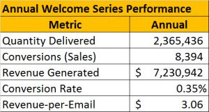
I always like to start big picture and then dig down. Here’s an ‘at-a-glance’ overview of the annual performance of the series:
Notice that I’m not looking at open and click-through rates – we will later, but for now a big picture view of the bottom line metrics is what we need.
We use the first three numbers to calculate the last two. Note that the conversion rate and revenue-per-email figures are calculated out of emails assumed delivered (non-bounce), not the unique number of recipients.
So why is this useful? It tells you how effective your program is. You can see what the return for your efforts is.
It also allows you to compare this series to other series that you may have running. For instance, cart reminder programs, promotional series or even a different welcome series that you are testing against this one.
When you chart this on an ongoing basis you can also compare performance of this series year-over-year. It provides you an internal benchmark you can use to gauge ongoing performance. You can (and should) do these same calculations on a quarterly basis, just as you should with all your marketing efforts. But I want to stay focused on what’s unique when you’re sending an email series, so let’s move on.
10,000 Foot View
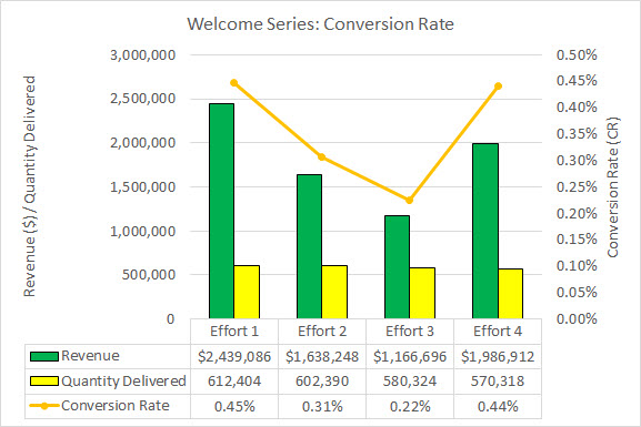
Next it’s time to dig deeper into the performance of each individual effort in the series. Let’s start with conversion rate.
This allows us to see how the efforts compare to one another. Note that effort 1 and effort 4 outperform the others in terms of conversion rate; effort 4 brings in a little less revenue than effort 1, due to the discount offer.
This chart tells us that efforts 1 and 4 are our most effective efforts; while effort 3 is no slacker, with a 0.22% conversion rate, it is the weakest of the series. There are two courses of action that this chart suggests to me — and they aren’t mutually exclusive:
- Effort 1 is delightfully successful – it has a conversion rate similar to the discount offer in effort 4 but without the discount! These people are ready to buy right out of the gate – is there a way we can get even more of them to do so and boost the conversion rate here? That will be the goal of our testing on effort 1 – we’ll use the open and click metrics to figure out how to go about it (more on that in a bit)
- Effort 3 is lagging the others – its conversion rate is half that of efforts 1 and 4. Is there a way to boost its conversion rate? Again, we’ll use the open and click metrics to get a read on how people are engaging with effort 3 and see which levers we might use to boost performance. Another option potentially worth testing: if we eliminate the current effort 3 and send the current effort 4 in its place (instead of later), will we generate revenue equal to or greater than the sum of current efforts 3 and 4? It might be worth a test – and there is value in recognizing the revenue even a few days earlier.
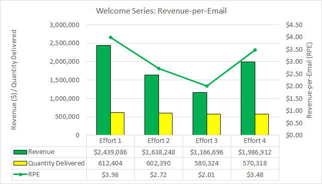
At this stage I also take a closer look at revenue-per-email (RPE).
This chart supports the learnings from the conversion rate chart – the rise and fall of the RPE pretty accurately mirrors the rise and fall of the conversion rate. But here effort 1 is alone at the top; effort 4 follows close behind (because of the discount offered), while effort 3 continues to lag the others.
View from the Roof
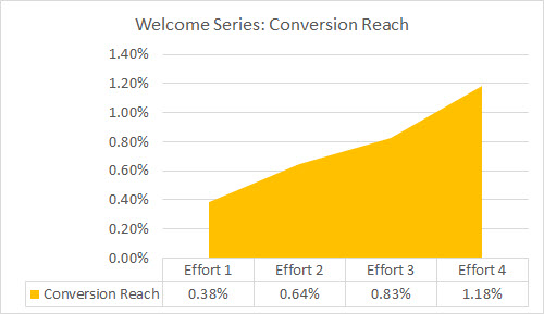
Next I like to look at reach to get a different but important perspective on how readers are interacting with the series.
Reach is kind of like conversions, opens and clicks, but instead of looking at unique conversions, opens and clicks on a single email, you are tracking unique conversions, opens and clicks (one per person) over the entire series. The larger percentage of your list that you “reach” over the course of the series, the higher your likely return will be.
Conversion Reach looks at the cumulative conversion rate across all efforts; here the welcome series maxes out at 1.18%, meaning that over the course of the series just over 1% of people on the list purchased.
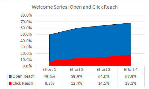
I usually like to graph open and click reach together so you can see the relationship between the two (which is then charted as the click-to-open reach, see that next).
Above you see the open and click reach, by effort, for the welcome series. The open reach is pretty healthy – over the course of the 4 efforts nearly 68% of the list opened at least one effort; that’s nearly 7 out of every 10 people. Open reach here follows a pretty common pattern – very good on effort 1, a large bump with effort 2 and then more gradual increases with efforts 3 and 4.
The click reach story isn’t as bright; click reach tops out at just over 18%, which means that nearly 2 out of every 10 recipients clicked on at least one email in the series.
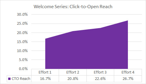
While both of these are good, the most valuable reach metric is click-to-open reach.
Above you see the click-to-open reach for the welcome series. Click-to-open (CTO) reach divides the number of unique clicks by unique opens over the course of the series. The goal for CTO reach is 50%, meaning that you want half of those who open to also click. The more efforts you have in the series the easier it is to reach this goal. Here we max out at just under 27%, so there’s room for improvement.
Street-Level View
This is where we look at traditional open and click rates by effort. While this is the easiest data to get, it’s much more valuable when combined with the metrics outlined above.
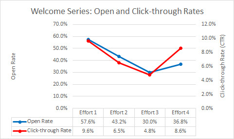
Let’s start by looking at the open and click-through rates by effort.
Again, the pattern is pretty traditional. The open and click rates gradually decrease; the last effort shows a bump up in click-through rate as the result of the discount offer.
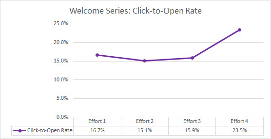
We can also look at the click-to-open rate (CTOR), which isolates engagement on the body of the email by adjusting for any variance in open rates between the efforts.
As expected, the final effort with the discount leads in terms of click-to-open rate. Of interest is the low variance in CTOR rates between efforts 1, 2 and 3. While effort 1 is a little ahead, it’s less than a full percentage point more than effort 3. So the large numbers of opens, not the body of the email, is the primary cause of the high conversion rate on that effort.
In Closing
Multi-effort campaigns can be tremendously profitable, especially if they are automated like the welcome series we examined here. But you need to look at the performance of the series as a whole, not just at how each individual effort does, to truly gauge success or failure and, more importantly, to idea opportunities to test and boost your bottom line revenue.
Try analyzing your next multi-effort campaign this way and let me know how it goes!
