Happy Throwback Thursday! This article is 2 years old but the tips here are just as relevant — and just as effective — today. While people are scrolling more than they did back in the 1990s, it’s still best not to count on them finding your email sign-up call-to-action. Put it in a prominent location where they won’t miss it! Enjoy!
One key to a successful email marketing program is list growth; you want to be adding new people to your list, preferably via opt-in, on an ongoing basis. Here’s a quick case study on how a small change yielded big results.
Last year I began working with a new client. First up: an audit of their email acquisition program. The analysis turned up a number of things, but there was one simple thing that I noticed right away.
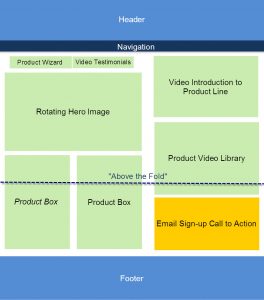
The call-to-action to sign up for email was at the bottom right of the page, below the fold (see the wireframe layout below).
As a business-to-consumer e-commerce company, the primary mission of the client’s website is to generate revenue. That’s why they “buried” the email sign-up call-to-action, opting to put product information in the “prime real estate” above the fold. Visitors who didn’t scroll past the fold didn’t see it; and even those who did quite likely missed it.
Now, here’s the thing about scrolling: people do scroll more today than they did back in 1995. When the World Wide Web was new, scrolling was rare – most people were relatively new to reading content online and they didn’t necessarily realize that you could scroll.
Fast forward to 2013. Just about everyone is comfortable reading online and scrolling is no longer a foreign concept. But, in my experience, the part of the web page that appears “above the fold” is still your prime real estate. Just because people can scroll doesn’t mean that they will.
And you certainly don’t want them to have to scroll to look for your email sign-up. No matter what the primary goal of your website is, the secondary goal should be to entice people to provide you with their email address. This gives you the opportunity to build a relationship with them and, hopefully, pull them back to your website in the future to fill out a lead generation form, make a purchase, view advertising, or whatever you need them to do to boost your bottom line.
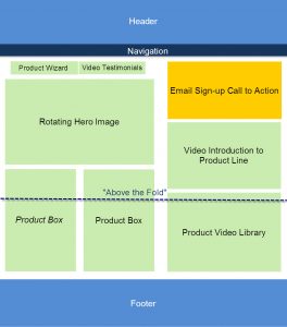
So, my hypothesis for the first test was that we could increase email list growth by moving the existing email sign-up call-to-action (same copy, same design) up above the fold (so that visitors would see it without scrolling).
The only concern the client had with this test was the potential impact on revenue. If we devote less of the “prime real estate” above the fold to messages that generated revenue directly, wouldn’t revenue suffer? Would the value of the additional email addresses gathered make up for any loss?
We did an A/B split test comparing the control (above) to a test page (below), where the email sign-up call-to-action was moved to the top of the right column, above the fold. Everything else about the call-to-action – the offer, the incentives, the copy, the design – remained exactly the same.
The result? The test generated a 30 percent increase in email sign-up conversion rate. Just by moving it to a more prominent place on the page, we got a boost in list growth.
Even better – we didn’t see a decrease in revenue generated by this page. In fact, the test page generated 27 percent more revenue than the control. So not only is the client’s email list growing more quickly, so is their bottom line, thanks to this small change.
This was just the first step toward improving this client’s email acquisition. But it was so simple. Take a look at where your email sign-up call-to-action appears and, if it’s below the fold, test making it more prominent and see what kind of a boost in conversion rate you see.
Until next time,
Jeanne


