Years ago I was obsessed with preheaders, aka snippets or autopreview, and wrote about them in my ClickZ column. Back then I did a lot of testing of preheader copy and generated some great results for clients.
Fast-forward to today. I still consider preheader text when I’m helping clients optimize their email efforts, but am no longer obsessed. But maybe I should be…
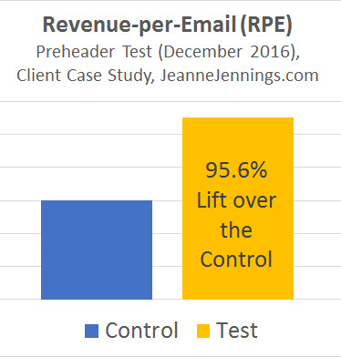
A recent test generated a 96% increase in revenue-per-email — nearly double the control — and all we did was change the copy in the preheader. It was an A/B split test — everything else about the creative was exactly the same; we randomly split the list in two and sent the messages at the same day and time.
First let me share with you the methodology I used to come up with the preheader test copy that soundly beat the control; then I’ll give you the full text of the subject line and both preheaders (control and test) in a case study so you can see how it was applied.
To my thinking, there are a few models you can use for writing preheader copy:
- Ignore it and don’t write any
- Mimic the subject line verbatim or nearly verbatim
- Restate the subject line, using different terminology
- Make the preheader copy a continuation of the subject line
- Build on the subject line, with a secondary message point
- Create a brand-specific preheader that is the same for all messages, regardless of what copy is in the subject line
Let’s take a quick look at each. I’m using screenshots from gmail to show you samples; you’ll see:
- the friendly from address at the left, in bold type
- the subject line just to the right of the friendly from address, also in bold type
- the preheader copy immediately following the subject line, not in bold type
1. Ignore it and don’t write any
You don’t have to write preheader copy. But if you don’t, whatever text appears first in your email message will likely appear in its place, which is usually your ‘view in browser’ message (see above).
The preheader is a piece of prime real estate, along with the from and subject lines, that helps you engage the reader and get them to open your email. Wouldn’t you rather have something benefit-oriented here to engage them?
2. Mimic the subject line verbatim or nearly verbatim
I was a bit surprised to find brands doing this, but they do; see the example above.
I realize, in the example above, that not a lot of the preheader is seen. But I believe that even just these 16 characters could be put to more effective use. Image what you could do with the extra 25 or more characters shown in most of these examples.
3. Restate the subject line, using different terminology
This isn’t a bad way to go. In fact, this is part of the hypothesis we used in the test mentioned earlier that was so successful.
But usually if you are restating the subject line it’s because you don’t really understand the power of the snippet or you have multiple terms for the same thing that you want to include. We’ll talk more about this in the case study at the end, as the winning preheader text had an element of restating the subject line.
4. Make the preheader copy a continuation of the subject line
I’m a bit biased here; this is the formula I use for the preheader text in my own email newsletter. Here’s my thinking…
The items I include in each issue of my email newsletter (usually 6 in total, but sometimes a few more) are what provide readers the benefit and make it unique. So the topics covered in each issue are what I want to feature in the subject line, the preheader text and the headline.
When there are six items it works perfectly; I used two topics for each of these three items so that all are mentioned either before the open or in the preview pane view. In the example above, here’s what we used for each:
- Subject line: [MEDM] Deeper email analytics, scoring social media and more
- Preheader: Transparent marketing, a Grinchy holiday for retailers and more
- Headline: Dynamic Countdown Timers, Drip Campaigns and More
In this model the ‘formula’ for each of these three pieces of prime real estate is the same (use 2 topics from the newslettter) but the specific content of each is different.
5. Build on the subject line, with a secondary message point
This is one of my favorite models to use for creating preheader copy.
When I work with clients we typically have a message map, listing the different concepts we want to present in order of priority. If you’ve used the first item in your subject line, it only makes sense to make the second the topic of your preheader text.
In the above example the savings, or the offer, is featured in the subject line; they add urgency to putting the sale deadline in the preheader copy, along with a “Shop Today” call to action. The preheader builds on the subject line idea; the message is related but different.
6. Create a brand-specific pre-header that is the same for all messages, regardless of what copy is in the subject line
You’ll have to trust me here; I get these types of messages from Amazon.com frequently and the preheader text is always the same. While I could probably make a case for using the brand name in the preheader, using it twice would be a more difficult sell.
I understand that this is an automated message (it is a list of products related to a search I did on the site), so customizing the preheader for each send would make more work.
But even if the preheader just said something like “Based on your recent visit, we thought you might be interested in these items” (which is the opening sentence of the email) it would make more sense than the current preheader copy.
Case Study
Now on to the case study. The client is an online retailer; their goal is to generate revenue by having customers click-through from the email and purchase.
Here’s what we started with, the content that was part of the control:
Subject Line: Time is Running Out on our Best Selling Custom Items!
Control Preheader: Time is Running Out On Our Custom Items!
As you can see, the client was using the second model mentioned above, mimicking the subject line verbatim or almost verbatim.
In order to come up with some preheader text options, I looked at the email itself and clicked-through on a few of the products listed. After reading the product descriptions and looking at the fields involved in ordering I realized that these items could be personalized.
You could add a person’s name, a branch of the military (the company;’s target audience is veterans and their families), or anything else. The items featured were hats and coats; the email was sent between Thanksgiving and Christmas, a prime gift-giving season.
The subject line did a good job with urgency (‘time is running out’), so we didn’t need to cover that in the preheader. But I felt strongly that the word ‘personalized’ was the key to boosting response — it needed to be in the preheader text since it didn’t appear in the subject line.
Also not in the subject line: gift, which was the second word which I felt needed to be in the preheader text.
When we presented a few test subject lines to the client, along with our reasoning, he added to it. He suggested that the word “Veteran,” which was also not in the subject line, should be in the preheader. So we built our test preheader around these three key words and ended up with this for a test panel:
Subject Line (both): Time is Running Out on our Best Selling Custom Items!
Control Preheader: Time is Running Out On Our Custom Items!
Test Preheader: Great Personalized Gifts for Veterans!
As I mentioned above, it was a true A/B split test to get a clean read on the preheaders. The creative was exactly the same except for the preheader text; the list was split into two randomly and the messages were sent at the same day and time.
 The test version generated nearly twice as much revenue-per-email (RPE) sent as the control — the lift was 95.6%.
The increase in RPE was pretty much driven by more transactions, more people making purchases — the conversion rate for the test version was 92.6% higher than for the control.
Are you wondering about the open and click-through rates? They were roughly the same for both, less than a 2.0% difference.
Looking back on it, I think there’s the opportunity to get even bigger lifts for future sends that are similar in nature if these three key words — Personalized, Gifts, Veterans — are used more prominently .
If they appear in the subject line I might relegate the urgency message to the preheader. They could boost response if used more prominently in the headline and body of the email as well (‘Veteran’ was in the headline and ‘personalized’ was used once in the body; ‘gift’ did not appear at all).
Words matter. In this case, ‘personalized ‘is a more effective word than ‘customized’ and ‘gift’ is a more value-oriented word than ‘item’ (especially during the holidays). ‘Veterans’ tipped the scale even further because it put the image of the target audience into the reader’s mind. “What Veteran do I know who would appreciate a personalized gift?” is what pulls them in and drives the sale.
So take a little more time with your preheaders, give a few of the models listed above a test drive, and let me know how it goes!


