Is image blocking still an issue that email marketers should pay attention to? Back in 2014 Litmus reported that 43% of Gmail users were reading messages without images enabled. A lot has changed since 2014, has this?
Background
Our starting point for this Black Friday campaign was an email from the previous year, which had performed very well. You can see the wireframe below.
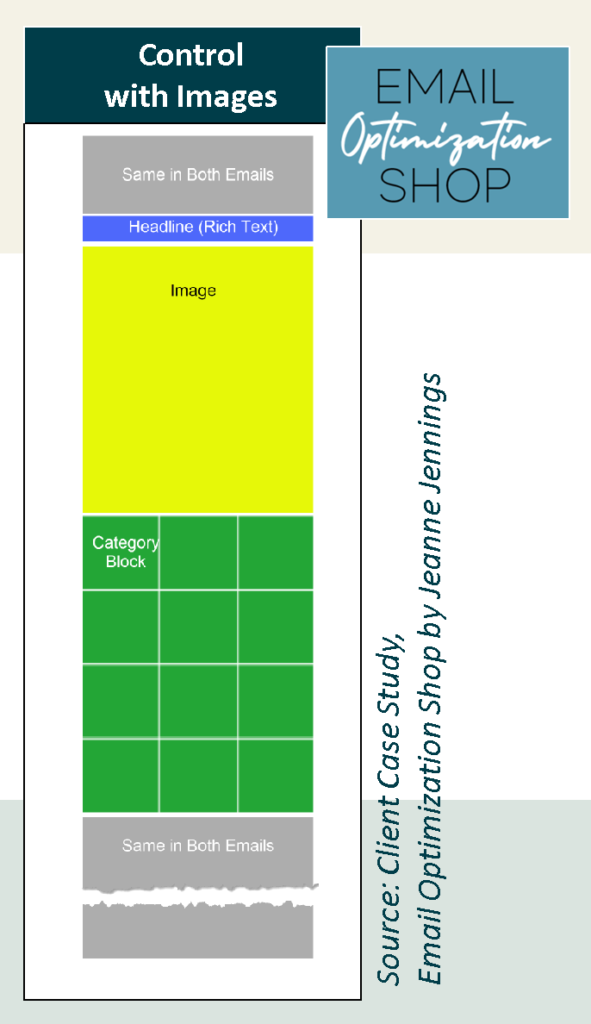
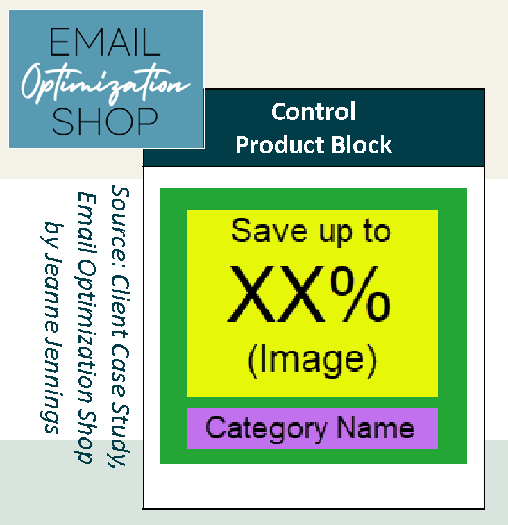
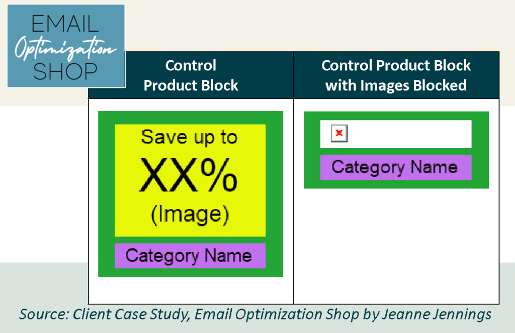
This email was unique in that it didn’t feature any product images; instead, the discount, in a percent off format, was featured for each product category; each category got its own category block. See an example at the right.
It all looks just fine when images are enabled, but when they aren’t… Not so much.
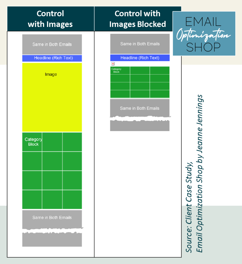
You see, the large top image as well as the ‘% off’ images in the category blocks don’t appear, so there’s not a lot to engage the reader.
The Test
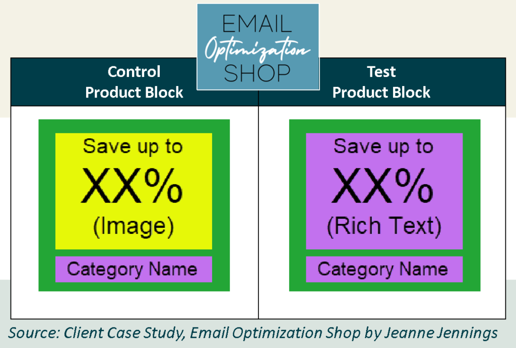
Our hypothesis was that performance would be improved if the ‘% off’ in the category blocks would appear even when images were disabled. This was easy to do; we just replaced the image with rich text. See the example at the left… and below.
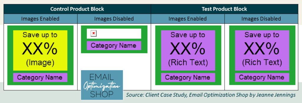
Here are views of the control and the test emails, both with and without images enabled.
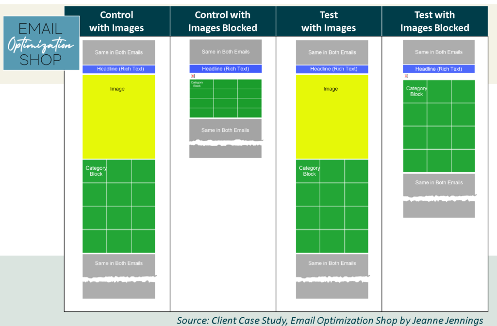
We did a simple random split of the list. In this case, the numbers weren’t exactly even, but close enough. Each segment had at least 150,000 in it. This is well above my minimum cell size of 20,000, which almost always allows me to get statistically significant results. See the split below.
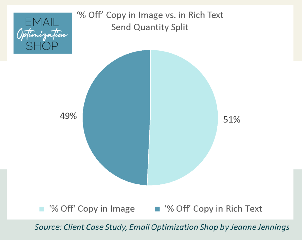
As always, we kept everything except the ‘% off’ text in the category blocks the same, so we could get clear results.
Which version do you think won? Was it the control with the ‘% off’ in the image? Or the test where the ‘% off’ is in rich text? Or was there no difference?
I’ll give you a minute to think about it… then scroll down to get the answer.

Results
Here’s are the results!
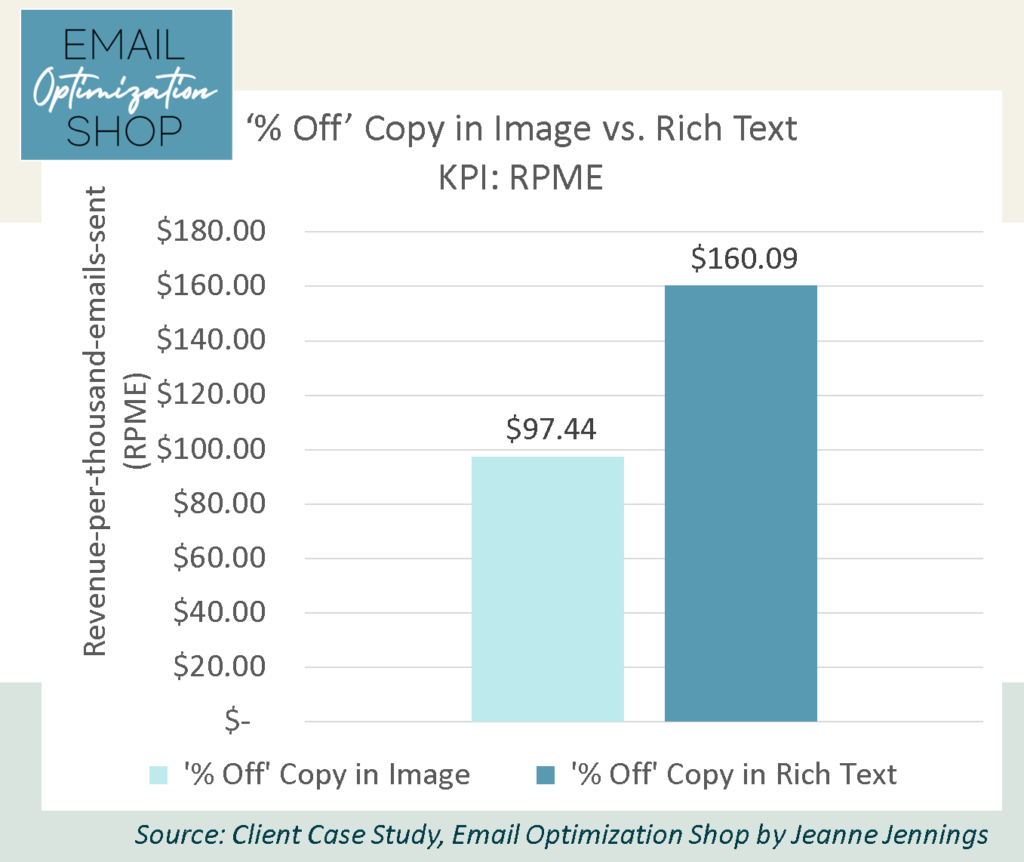
That’s right. Making the ‘% Off’ copy rich text, instead of an image, delivered a better RPME.
How many of you guessed correctly?
Our key performance indicator (KPI) here is revenue-per-thousand-emails-sent (RPME), because we are looking to optimize revenue.
Note: We used RPME instead of revenue-per-email (RPE) because the RPE numbers were small. By increasing the magnitude it makes it easier to see variances – and the relative variance between the cells remains the same.
Here are the full results.

As you can see, the test version, with the ‘% off’ copy in rich text, generated an RPME 64% higher than the control, where the ‘% off’ copy was an image. More than $160 compared to $97 and change. What kind of a rock star would you be if you could increase the revenue your email generated by 64% with a simple test like this?

As you can see, there was not a statistically significant difference between the two versions in the open rate, click-through rate (CTR), or click-to-open rate (CTOR). So if you were using any of those as your KPI, you would declare that there was no difference – and you would be incorrect. This is just one more example of the importance of using a business metric as your KPI.
The variance here was caused by the average order value – which was 74% higher for the test version, where readers were able to see the savings even if images were disabled. There was very little difference (5%) in the conversion rate between the two versions.
Were we surprised by the result?
No. Nine times out of ten making copy readable even if images are blocked boosts performance, in my experience.
Take-aways
The key takeaway here is to always design for image blocking. In this case, the two emails looked exactly the same with images enabled – so there was no impact if images were enabled, but the test was a more effective email when images were disabled.
Give it a shot and let me know how it goes!
Be safe, stay well,


Featured Image: Vaughn Spann’s “Carolina Blues (Marked Man)” — Photo taken by Jeanne Jennings, February 19, 2023, at the North Carolina Museum of Art
