Years ago, when I was taking questions after a presentation to a group of B2B marketing professionals, an audience member stood up and asked ‘Why are some B2B email newsletters so terrible?’
I was reminded of this when I found the B2B newsletter to the left in my inbox and opened it. Let’s not say it’s terrible – let’s say that there are some simple things they could do to make it a whole lot better.
Here’s a short list to get them started – and if you’ve got a B2B newsletter, this is your cue to take a look and see if any of these recommendations could make it more effective – and more profitable – for your organization.
1. Don’t make it all about your organization
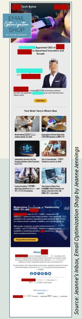
I always blur out details so as not to shame anyone. But when I started to do that here, I realized that a different treatment would be more useful.
See all those red blocks in the email?
-
- 2 at the very top
-
- 4 in the first section
-
- 3 in the section with the dark blue background
-
- 4 in the footer
Those 13 red blocks cover the company’s name. It appears over and over again.
And if that’s not enough to make readers feel like this newsletter is all about the company…
That first item below the header image – it’s announcing the name of their new CEO. His name is covered with an aqua block – it’s featured 3 times. There’s also a large picture of him.
How is this of interest to customers and potential customers, who are the target audience? This type of information would be appropriate for an internal company newsletter – but not here.
I can think of one exception to this – that would be if the new CEO was a well-known person. Someone like Warren Buffett, Taylor Swift, Mark Cuban, Ryan Reynolds – someone like this. But this person is not well-known, at least not in the U.S. market.
Even the copy doesn’t make the case for why the reader should care about this new appointment. The headline and blurb don’t focus on the CEO’s experience – it’s about the company and what they do.
The middle section, under the ‘Tech Brief: Here’s What’s New’ header, features links to content that may do a better job of providing value to the reader. We’ll talk more about that in the next section.
Then we have the section in dark blue – which is also all about the company with a call-to-action to request more information.
And then we have the ‘About [Company Name]’ section which is… all about the organization.
2. Deliver on the promise of the subject line
Here are the friendly from line, subject line, and preheader text as they appeared in my Outlook inbox:
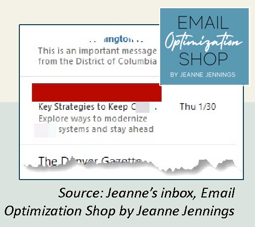
And in my Gmail inbox:
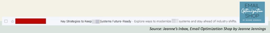
Here it’s fine that their company name appears – it’s a best practice and a CAN-SPAM requirement that the from line accurately identify the sender.
But the subject line and preheader text… they’re pretty generic. And the top one-third of the email message definitely doesn’t deliver on this promise.
Speaking of the top one-third of this email message…
3. Design for image blocking
I feel like almost everything I write these days talks about image blocking. It’s always been important, but even more so now that many inbox providers are replacing preheader text with AI-written content summaries.
The top of your email is critical to engaging people who use a preview pane, which many Outlook users do. And since this email is going to a B2B audience, it’s likely that readers are using Outlook or another email client that’s prevalent in the work environment.
Here’s what I saw in my Outlook inbox initially, when images were disabled by default, and later, when I enabled images for this message:
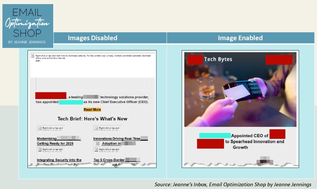
When images were disabled, the top of the email wasn’t very engaging, but the articles from the middle of the message were pulled up and I could see them. That’s not a bad thing, since this is the ‘value-without-a-purchase’ content in the newsletter (more on that shortly).
When I enabled images, all I could see was the first headline about the new CEO. Not great for engaging readers. Oh, and a large image of someone using a blank card (I guess it’s supposed to be a credit card? It looks like a room key card) to pay at a bar.
Usually, the version with images enabled is better – I don’t think either of these preview pane views are great, but the one with images disabled, where the value-based article titles appear, may actually be a little better.
4. Provide value without a purchase
When I work with clients in Europe, they often use the terms ‘email newsletter’ and ‘email message’ interchangeably. They’re one and the same to them.
But here in the United States that’s not the case. A newsletter has at least some content that provides value without a purchase – coming from the publishing world, I call this ‘editorial’ content.
It looks like the items under ‘Tech Brief’ do meet this standard. In fact, I clicked through on the first article about ‘Getting Ready for 2025’ and it was kind of interesting. It included 10 trends for 2025, along with some industry stats, with a brief promotional pitch at the end.
The title in the newsletter didn’t really do the content justice. A more engaging title, something that was benefit-oriented that spoke to the value the reader would get if they clicked through to read it, would really help here.
You know what else would help – some brief blurbs, just a sentence, about each of these articles. Not that they’re pressed for space, but a brief benefit-oriented blurb would be of more value to readers than the images. But in truth they should include both the image and the blurb with the title, to help them with the next recommendation on my short list.
5. Honor the 60/40 rule
I have been relying on the 60/40 rule since the early 2000s, when I was head of email for what was then the largest B2B publisher in the U.S., Reed Business Information US. I’m always surprised when others don’t know it, or don’t abide by it.
Here’s the 60/40 rule in a nutshell:
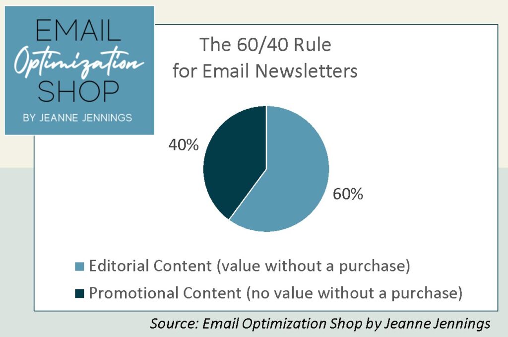
And a little more description, with a focus on B2B (not B2C) newsletters:
- Editorial Content
- Articles about industry trends
- Interviews with industry thought leaders
- Things that will help the reader understand the industry and/or do their job better
- Promotional Content
- Articles about people your company has hired or promoted
- Content that promotes your product or service
- Offers to purchase your product or service, even if there’s a discount
This is focused on B2B, but the 60/40 rule applies to B2C email newsletters too.
So let’s look at this newsletter. If we ignore the header image, I’d say this newsletter is roughly 70% promotional (no value without a purchase) and just 30% editorial content (value without a purchase). So the ratio is flipped from where it should be. The only part of this email that could be considered editorial is the middle ‘Tech Brief’ section.
Why is the ratio important?
Think about a magazine. You buy it for the articles – and as you’re reading the articles, you see the ads that are mixed in,
Email newsletters are based on the same philosophy. The editorial content entices recipients to open and read your email newsletter. And then they see the promotional content that’s mixed in.
There not only needs to be enough editorial (value-without-a-purchase) content to justify opening this message, you need to provide enough that the next time your email shows up in their inbox they want to open that too.
If they open a few times and only find promotions, they’re unlikely to open again – unless they know that they are ready to buy. Which is typically a small portion of your list.
6. Check that everything renders properly
This last one is a general recommendation, no matter what type of content you’re sending.
When I looked at this email in Outlook, there was an odd white block toward the bottom. I saw what was missing when I looked at the email in Gmail; it’s a rendering issue (see below).
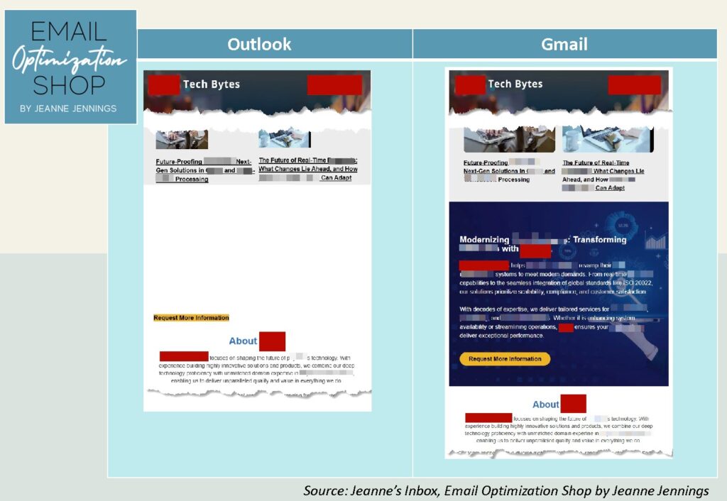
The sender probably wanted this to show up – it’s a promotional block. But the only thing that I saw in Outlook was the CTA button. Not enough to drive action.
Litmus is one of the best tools to check how your emails are rendering across different email clients. There are others out there as well. Every sender should check to see that the content they are sending will appear as it should no matter what email client the recipient is using.
In Closing
B2B emails don’t have to be terrible. There are lots of good ones out there. But you have to put some time and expertise into your content and layout. Always think about your reader first – make sure you’re not sending a promotional piece pretending to be an email newsletter.
And if you’re looking to create a new B2B email newsletter, or make an existing B2B email more engaging and effective, I can help. Let’s chat!
Until next time,


Photo by Pourya Jan on Unsplash