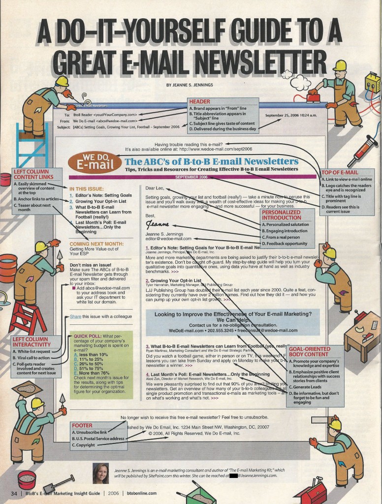
Back in 2006 I collaborated with BtoB Magazine (now part of Advertising Age) on an infographic (I don’t remember calling it that back then, but in hindsight — that’s what it is!) for their Email Marketing Insight Guide — I provided the ‘best practices’ and a mock-up of a B2B email newsletter, they added some cute ‘handymen’ (just checked — none of the characters look like ‘handy women’ unfortunately) around it.
The original email newsletter infographic appears below (click on it to open it in a new window — click again to make it larger) — keep reading past that for my thoughts on what still holds up and what I’d do differently today, 8 years later. And let me know your thoughts in the comments.
What Holds Up in this Email Newsletter
Interesting how best practices in header information — the From, To and Subject line content — really haven’t changed. While today we might add some icons to the Subject Line, this is all still relevant. As is sending a B2B newsletter during the business day.
It’s still a best practice to include some rich text in the preview pane view of your email, in addition to your logo. If you have any questions about this just see the Litmus blog post from May 2014 about 43% of Gmail users reading email without images enabled.
Polls are still a great way to engage readers – and to gather information which can be used for future articles.
It’s still important to make your articles fun and engaging — as well as making sure they showcase your area of expertise.
Finally, US CAN-SPAM laws haven’t changed significantly since 2006 — so having an unsubscribe link and the sender’s US Postal Service address in the footer is still a best practice.
What I’d Do Differently Today
One thing we know today which wasn’t quite as evident back in 2006 is that quality trumps quantity. It would take a good bit of work to pull together all this content for a single email newsletter — and you’d very likely get the same or similar benefit from an email newsletter with fewer items, as long as they were all high quality. Then you’d have a choice — you could keep the same frequency but use fewer items — or you could increase your send frequency and just distribute these items between 2 or more email newsletter issues.
We also weren’t thinking about responsive design and coding back in 2006 — so if I were to revise this for 2014 I’d modify the design to make it easier to translate for viewing in small, medium and large screens.
While you still want to have a link to read the email newsletter online, it’s no longer a best practice to put it right at the top. This makes it part of the snippet (also called pre-header or auto-preview) copy and it’s not a good use of that primary real estate. so I’d move it down or put some more benefit-oriented text above it.
Social media wasn’t as front and center as it is today. I would add links for social media sharing but, more importantly, I would leverage content from social channels here in the newsletter. Perhaps an engaging comment or two from a LinkedIn group, along with a call-to-action to join the discussion.
All in all, I think this has held up pretty well over the past 8 years — would love to hear your thoughts!
