From time to time I’ll pull a message from my inbox and do a walk-through of its pros and cons. These gentle critiques are intended to educate; I hope that the companies mentioned as well as readers will keep that top of mind.
This is the tale of three email messages, sent over the course of four months from the same organization. As with any great story, there are high points and low points to this tale — read and score it yourself, decide whether the positives outweigh the negatives. This organization is certainly trying and making progress, but are they succeeding?
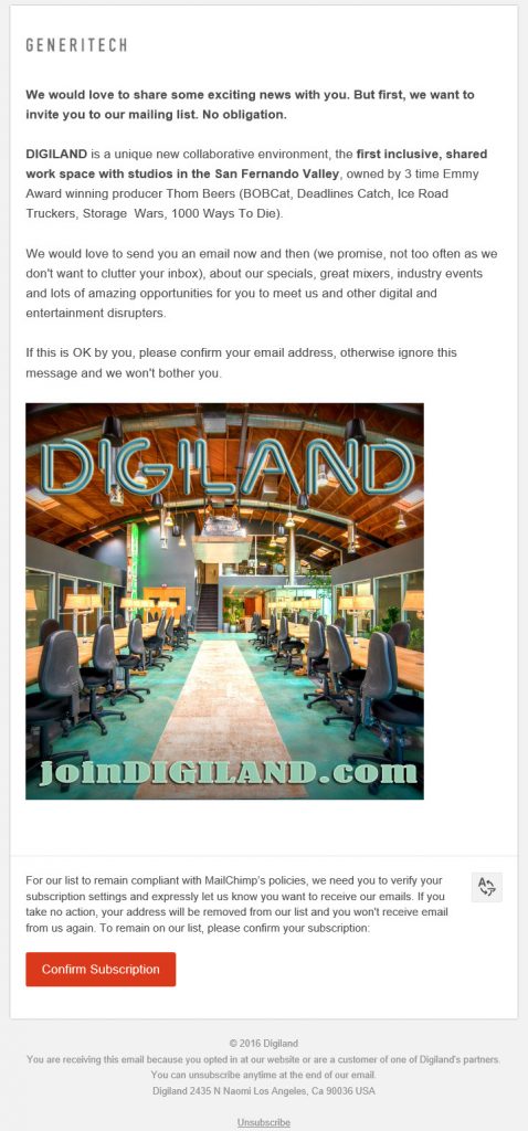
The email I received yesterday, the last of the three, follows. Read it quickly, gather your thoughts, then read my thoughts below.
From Line: DIGILAND
Subject Line: Want to get emails from DIGILAND?
Got your list with scores? Here’s mine:
My initial take was a positive one — most organizations, when they are starting a list, practice negative option opt-out (where silence equals permission). I’m not a fan of that so I was happy to see that this was an opt-in request — opt-in is a best practice.
Score: +5
What is Generitech? And what does it have to do with DIGILAND? I’ve read and re-read the email and I still don’t understand why that’s there. I wonder if they ran this email past anyone outside the organization before they sent it. It’s often a good idea to get some feedback from your target audience; things that are obvious to you (like the relationship between Generitech and DIGILAND) may leave your recipients scratching their heads.
Score: -1
The San Fernando Valley? I live in Washington, DC. Why am I receiving this? How did they get my name and why do they believe this is relevant to me? I lived in California for 5 years before I was in high school — and I haven’t lived there since.
Score: -3
I would have liked to see more information about the features, benefits and advantages DIGILAND offers. The second paragraph is really all about DIGILAND, not about what’s in it for we readers. The third paragraph is better, but a little vague.
Score: -1
The fourth paragraph has the ask — which is good. They are asking me to opt-in to receive email from them.
Score: +1
But how do I opt-in? The ‘Confirm Subscription’ button is all the way down at the bottom of the message. This is a disconnect — it would be more effective if it were placed just below the ask.
Score: -1
The picture isn’t bad — but images were blocked by default in Outlook so I didn’t see it until I viewed the Web version. Does the image impact the reader — would someone who was on the fence about agreeing to receive email from this organization be more likely to opt-in after seeing this image? I think not. I’m not sure an image is needed, but this isn’t a strong enough image to justify its being here. The fact that the URL to learn more is part of the image is another questionable move. Including this URL as a “learn more” call to action might have been a good strategy, but that would have to be done as rich text so it was sure to be seen.
Score: -1
I think the last paragraph is too much information; it doesn’t help motivate people to action. It wasn’t until just now that I noticed that MailChimp is making DIGILAND opt-in the list; this suggests they’ve had an issue with spam complaints int the past. So that puts a little tarnish on the gold star they got for the opt-in.
Score: -3
The button to confirm you subscription is bullet-proof, meaning it will still be seen when images are blocked — DIGILAND gets a point for that.
Score: +1
The footer makes a claim that I either opted-in or that I am a customer of one of their partners. I am pretty sure I did not opt-in with this email address; I don’t know who their partners are. It would have been a more compelling statement if they had provided the name of the partner who provided them my email address. Or even better — if the partner that they say I have a business relationship with had sent me an email on DIGILAND’s behalf, rather than giving my email address to DIGILAND.
Score: -1
Final Score for this Email: -6
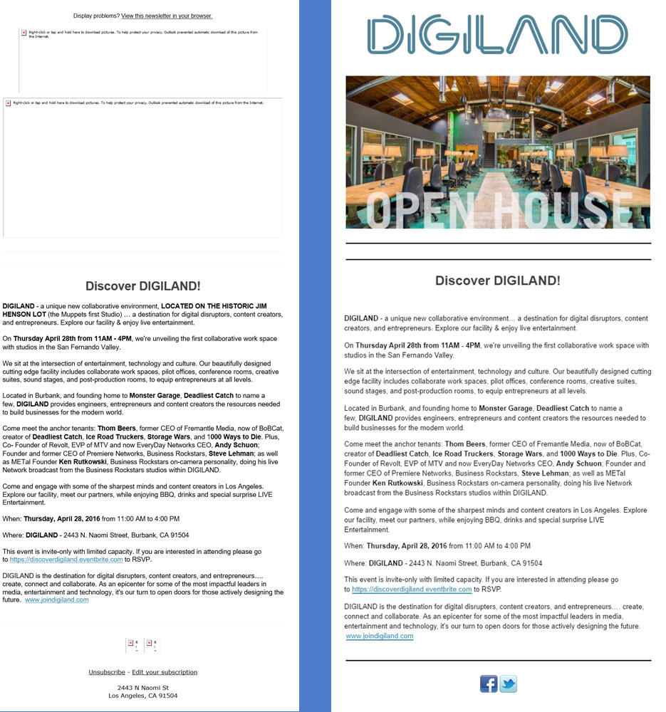
Now, I said this was a tale of three emails. When I searched my inbox tonight to find this email (which I had seen earlier) I learned that DIGILAND had sent me two emails back in April. They were pretty much the same creative; here’s a view without and with image enabled:
From Line (Emails 1 and 2): Join Digiland
Subject Line (Email 1): Discover Digiland!
Subject Line (Email 2): Reminder: Discover Digiland this Thursday!
Notice that when images are blocked the entire top of the email message is pretty much blank. I was very happy to see that the DIGILAND team adjusted their creative and used rich text at the top of the third message.
Also, the message here is very wordy. Even with the images enabled, there’s just so much to read. The third email did a much better job of being concise. If they really needed all this copy (I don’t think they do) then they could have made it more readable with better use of white space, columns, tables, bullet points, bold and other treatments.
While the third email missed some best practices, it was definitely more effective than the first two messages, so DIGILAND is moving in the right direction with their email program.
I wish the DIGILAND organization well. Here’s the thing: I don’t anticipate ever having a need for work space in Southern California. And I’m too far away to join them for events. So I didn’t opt-in.
