The subject line said “Getting close. You almost have enough points to redeem for a reward.” – truncated to “Getting close. You almost h…” in my inbox.
The preheader text said “Earn more points”
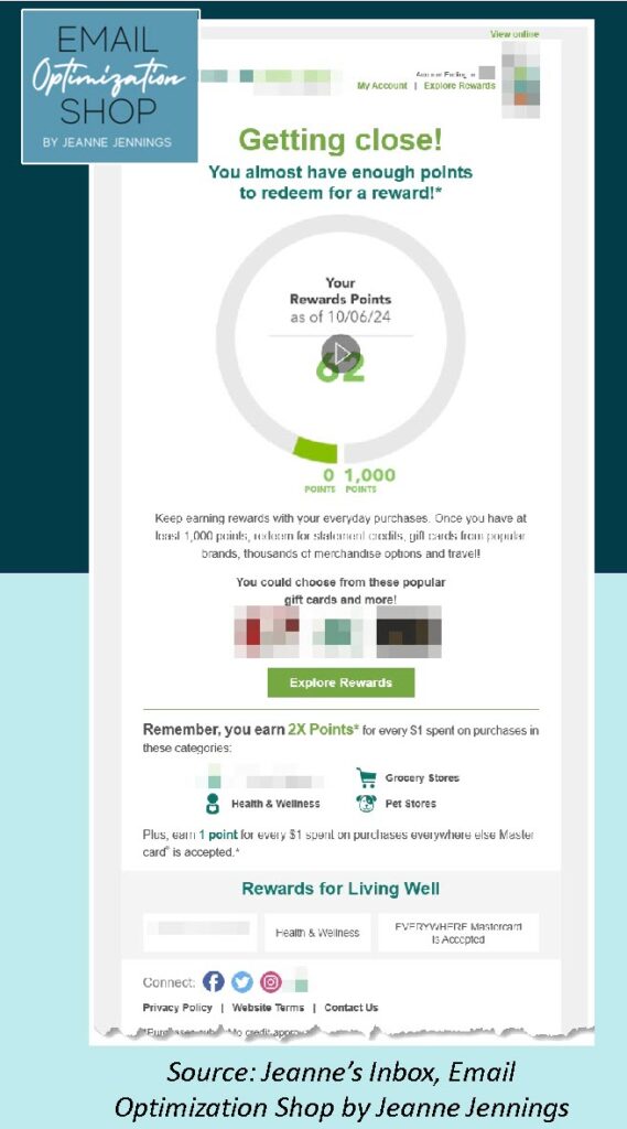
The email had a cute, animated gif component – and it looked like this (key content blurred for anonymity):
What are your initial thoughts?
It’s a good-looking email. Plenty of white space, easy to read, the copy is well thought-out, concise, and gets its point across. I would have preferred it if the headline and subhead didn’t mirror the subject line, but that’s a small thing.
But did the email deliver on the promise of the subject line and headline/subhead? Am I getting close to having 1,000 points, which is the minimum needed to redeem for a reward?
No.
Side note: the animation started at zero and filled in the circle chart with my points. I didn’t notice the animation at first, not until I took the screenshot and saw the ‘play’ carrot, at which point I investigated.
This very well-done email missed the mark with me – and probably with others who aren’t close to 1,000 points.
The simple fix for this: segmentation.
Everyone who had nowhere near 1,000 points should have received an email about using the card. The secondary message here, about 2X Points, would have been a great way to lead, with a note about a quick way to pump up my rewards points.
This isn’t difficult to do.
Moral of the story: when your email team is working on loyalty program communications, be sure the messages you’re sending are relevant to all your subscribers. Or use segmentation and targeting to improve relevance.
Until next time!

