Which segments of your list are most profitable? Are purchased lists always low performers? This client case study provides answers to both of these questions – as well as providing a framework for you to use to answer them for your own list segments.
As always, don’t just take these test results as gospel – do your own testing to see how your audience performs!
Case Study: Testing List Segments
Background
I’m a big fan of opt-in lists which have been built by my clients, and in most cases I find that opt-in names perform better than non-opt-in names. But let’s be honest. Many companies, especially in the B2B space, supplement their opt-in email acquisition efforts by purchasing lists.
While this isn’t a best practice, it’s done. But when you do it, it’s important to evaluate the quality of those non-opt-in names that you purchase.
That’s what we’re doing in this case study.
Test Set-up
We didn’t technically have a ‘control’ here – we decided to test 2 segments, both of which were purchased, against the balance of the list (much, but not all, of which was opt-in). As such, we decided to use the balance of the list as our control. Here’s how the list quantities netted out.

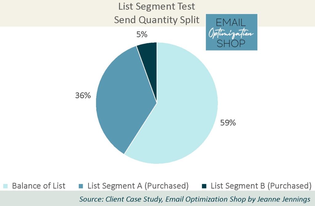
As you can see, list segment A makes up 36% of the send quantity, just over one-third of the total. List segment B makes up just 5% of the total send quantity. The balance of the send is nearly 60% of the database.
While I don’t want to talk specific quantities, I will tell you that all the segments, even that List B segment that’s 5% of the total, have more than 20,000 names in them (20,000 is my minimum cell test size; it almost always allows me to get statistically significant results).
As always, we kept everything except the list segment exactly the same. All got the same creative, sent on the same day, at the same time.
Which segment do you think won? Was it one of the purchased, not-opt-in list segments? If so, was it the larger segment A or the smaller segment B? Or was it the balance of the list, most of which is opt-in?
I’ll give you a minute to think about it… then scroll down to get the answer.

Results
Here’s are the results!

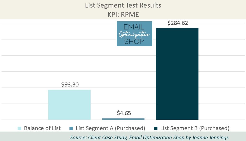
That’s right. List segment B, which was a not-opt-in, purchased list, generated a much higher revenue-per-thousand-emails-sent (RPME) than the other two segments.
How many of you guessed correctly?
Our key performance indicator (KPI) here is revenue-per-thousand-emails-sent (RPME), because we are looking to optimize revenue.
Note: We used RPME instead of revenue-per-email (RPE) because the RPE numbers were small. By increasing the magnitude it makes it easier to see variances – and the relative variance between the cells remains the same.
Here are the full results.

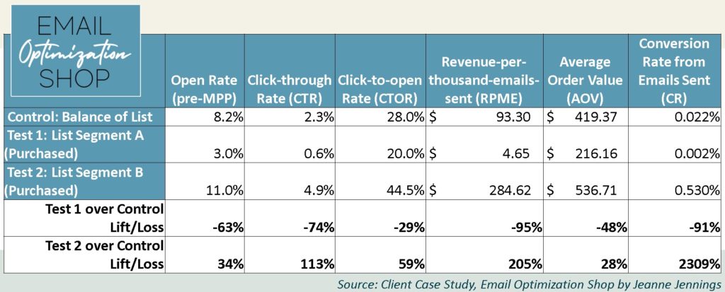
As you can see, test 2 (list segment B) generated more than three times the RPME that the control (balance of the list) did. $284 vs. $93 is a dramatic difference. And test 1 (list segment A)? Its yield was an RPME of just under $5.

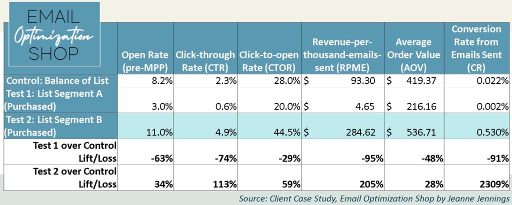
Going deeper, we see that test 2 (list segment B) lead all the other segments in every metric we typically look at.
The list segment B group:
- Opened at a rate 34% higher than the control group
- Clicked (CTR) at a rate more than double (113% lift) that of the control
- Had a click-to-open rate (CTOR) that was 60% higher than the control group
- We already discussed the amazing 205% lift in RPME over the control
- Had an average order value (AOV) 28% higher than the control
- And had a conversion rate – you’re reading this right – that was greater than a 2000% lift over the control.
Now, it’s good to declare a winner. But in truth, this wasn’t about declaring a winner – it was about evaluating the effectiveness of the purchased lists.
We were very surprised when test 2 (list segment B) did so well. It was unexpected.
We were not surprised that test 1 (list segment A) did so poorly.
You see, we had concerns that this purchased list was depressing our results – and potentially harming our deliverability.
And if you look back at the table above, you’ll see that test 1 (list segment A):
- Had an open rate 63% lower than the control
- Generated a CTR that was 74% lower than the control group
- Which resulted in a 29% decrease in CTOR
- The RPME was 95% less than the control
- The average order value was 48% less than the control group
- And the conversion rate was 91% lower than the control
Now look back at the pie chart at the beginning of this article. With list segment A being more than one-third of the database, it really does have the ability to depress our diagnostic as well as our business metrics.
This creates ‘static’ that makes it difficult to see how the majority of the names on the list, the control (balance of the list) here, is performing. And because we usually either (a) sent all the lists together or (b) segmented by industry (which crosses all three lists), we weren’t getting a clean read on the qualify of those purchased lists.
This taught us that the value of the list segment A purchased list (test 1) was much, much less than the value of the list segment B (test 2) purchased list. Each of these lists were refreshed/added to on an annual basis.
Based on these findings the client would continue to refresh/add to the test 2 (list segment B) purchased list at the current cost.
But the cost of list segment A was about the same, even though the value was much lower. So here we are looking to negotiate the price down or stop purchasing additional names from this source altogether.
Take-aways
So, does this mean that you should never purchase email lists? Or does it mean that you should always purchase email lists?
No. It just means that you need to evaluate any lists you purchase and gauge the value to your organization. You want to be sure you can make a profit on a purchased list; if you pay more than the revenue it generates, that’s a poor business decision.
Give it a shot and let me know how it goes!
Be safe, stay well,


Photo by James Thomas on Unsplash


