“Our blog just doesn’t drive leads.”
I hear this a lot. And I get it. The best blog posts aren’t hard-sell pieces, they provide value without a purchase and are intended to education, nurture and persuade — not to drive someone to buy right now.
But sometimes the issue is with the blog post page wireframe, not with the content. Read on for some simple changes you can make to the layout of your blog post pages to drive more leads.
I was working on an audit for a customer a while back. They mentioned that their product pages drove a ton of leads but their blog post pages drove almost none. I made a note and decided to take a look.
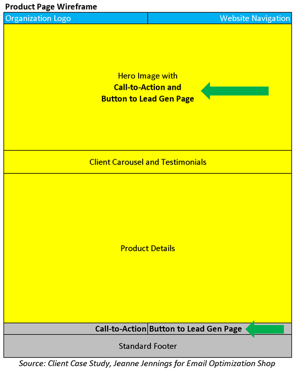
I started on their product pages (wireframe below). They were well done, and it was clear to see why they were so successful at driving leads.

“Good job!” I thought. Strong call-to-action right at the top with a button to the lead generation form. There was also a softer call-to-action in the footer with a button to the lead gen page. I’ve noted each with green arrows on the wireframe above.
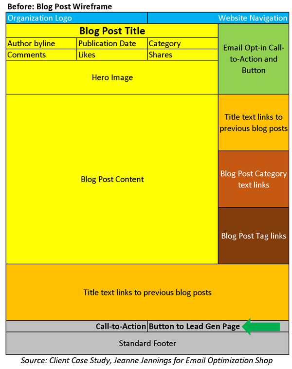
Then I visited one of their blog posts — the wireframe for this page is below.

This pages does a very good job of asking for email opt-in, which the product pages don’t do as well. But where is the lead generation call-to-action? At first I thought there wasn’t one, but then I saw it – right there in the footer.
It’s the same copy and button as in the footer on the product page, but it’s easily missed.
And then I looked at what was taking up the right column “prime real estate” under the email opt-in. It was a long list of previous blog post titles, then a long list of blog categories and finally a long list of blog post tags. It’s a great way to drive people to other blog posts, but is that really the goal of the page?
And is it fair to say “Our blog just doesn’t drive leads” if you’re not including a prominent call-to-action with a button to the lead generation form in a prominent location on the blog post page wireframe?
No wonder the product pages drive more leads.
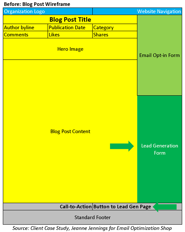
So I made some recommendations to make the blog pages a better source of leads. We expanded the email opt-in, adding fields right there in the right column. Then we added a lead generation form, right there in the right column. See the new wireframe below.

Having the form fields right there on the page means that it’s truly a one-click exercise to submit a lead or opt-in for the newsletter. You don’t need to click away from the page you’re on, submit your information, and then click again.
I don’t know if this new wireframe will generate more leads than the product pages, but then again…
I’ll keep you posted.
And if you haven’t already, now’s your chance to look at your blog pages. Does the layout make it easy for people to sign-up for your email and/or to ask a sales rep to contact them? If not, try these tips on your blog and let me know how it goes.


