Most of my consulting work is with large organizations, but I really love when I see smaller companies doing big things with the channel. And it also makes me sad when I see smaller companies trying, but not quite hitting the mark.
This post is about the latter, with constructive advice for this company (I plan to visit soon so maybe I’ll share it with them) and really any company that may not be putting their best foot forward in email. These are simple fixes that will dramatically improve the subscriber experience — and your bottom line performance.
I love the smell of lavender. I have a lavender plant in my kitchen; my bedroom and my drawers always smell like lavender. I had friends who were going social-distance strawberry picking and on a whim I googled lavender farm, to see if there were any nearby.
The Seven Oaks Lavender Farm website is charming. It’s just what you would expect — images of lavender fields with copy on a lavender-colored background. Here’s the home page…

Cute right? I looked around and started planning my trip. When I scrolled down and saw their email sign-up, I didn’t hesitate to fill in the form, which appears below.

The fields are large and they stand out, which is good. It’s hard to miss the form if you scroll down to the bottom of the page.
It’s smart of them to gather full first and last name and zip code in addition to the email address. This allows them to personalize the message — and to segment and target their list by distance from their farm. Someone like me who’s just about an hour away is likely to visit more frequently than someone who lives farther away.
They also do a nice job of laying out the benefit of having an email relationship with them. Official news, updates from the farm, lavender tips, craft ideas, recipes, and upcoming specials; something for everyone who loves lavender.
Also great — the button copy. One of my pet peeves are buttons that say ‘submit’ — it’s cold. But they don’t do this! ‘Sign me up!’ is what their button says and it’s completely in sync with their brand and website. Great job!
I do have one suggestion on the form. It really should be above the fold. It would have to be smaller, or a small box with a field for email could take you to a landing page where the rest of the information is gathered. But I have case studies showing that opt-in forms are more effective above the fold. They should test moving this up to see if it boosts their email list growth.
Once you enter your information, the fields disappear and you get a confirmation message (below). I confess — I skimmed it but nothing here seemed terribly important so I didn’t think much about it.

It’s a nice note. It’s on brand, it’s friendly. But’s there’s an important piece of information missing. Hold that thought for a minute.
A few hours later I was looking for another message in my email client and I saw the below in my inbox.
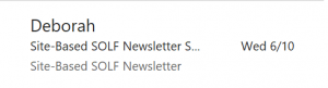
I wondered what this message was. So I opened it.
And I still had no idea what it was. Who was Deborah? What was SOLF?
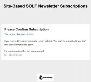
So I went on with my search for that other email message. But later in the day it was bugging me — what was SOLF?
So I went back. And I finally figured it out.
That note on the website after I opted-in? It would have helpful if it had told me that they used double opt-in and alerted me to watch my inbox for an email to confirm my subscription. If I had missed this email and not responded, I would not have been added to their list.
There are a few more things that Seven Oak Lavender Farm could do to improve this message.
Use the Seven Oaks Lavender Farm brand in the email
It’s nice to have a person’s name in the friendly from address and there have been studies done showing that it boosts open and conversion rates. But that doesn’t mean that you omit the primary brand from the friendly from address. I would have recognized ‘Deborah, Seven Oaks Lavender Farm’ or just ‘Seven Oaks Lavender Farm’ — but I did not recognize ‘Deborah’ — even though her name was on the post-opt-in note on the website. And I would bet that most people would not remember.
Another missed opportunity — the brand isn’t mentioned in the subject line either. Yes, I see the acronym. But there wasn’t anything on the website that prepared me to tie ‘SOLF’ to ‘Seven Oaks Lavender Farm.’ Sure, if you think about it you figure it out. But you don’t want to force your subscribers, especially the new ones, to figure it out.
The headline? Another missed opportunity. Once again, they use the unfamiliar acronym instead of the familiar brand name. Even the body copy doesn’t say the full name of the brand.
Make the voice and tone of the copy in the email match what’s on the website
This email is so different from the website. It’s difficult to believe they are related. With just a little work this could be fixed — they could present a consistent experience.
We talked above about the including the full brand name. But more than that, the copy here needs some massaging.
The full subject line is ‘Site-Based SOLF Newsletter Subscriptions: Please Confirm Subscription.’ The problem is truncation, which is very common with email subject lines. A simple change to ‘Please confirm: Lavender Farm email’ would make sure that recipients don’t miss the need for action and ‘lavender farm’ would be a good reminder of why you’re receiving this email.
The preheader (go back to the inbox view to see it) pulls in the email headline — which closely mirrors the current subject line. This is prime real estate to get the open — it would be nice to see them use this space to support and build on the subject line, rather than mimic it. Once again, I have case studies to support my recommendations here.
Then there’s that headline. This is another place where, in addition to mentioning the brand, they need to channel the voice and tone of the website. This is so sad — this email doesn’t look like it has anything to do with the charming website I visited earlier in the day.
Finally, which the primary purpose of this email is to get the confirmation, it would be nice to get a quick reminder of the benefit of having an email relationship with Seven Oaks Lavender Farm. They say it so eloquently on the website; they need to do the same here.
Carry the look and feel of the website through to the email
The other things that need to be carried through from the website is the look and feel. You’ve got limited space but just one image of a lavender field — or some lavender color, either background or text, in the email would really help.
Once I confirmed my subscription, I got a confirmation email. It’s below.
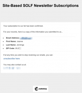
This email has all of the issues that plagued the email above. But it has a few more.
It’s missing valuable information reminding me of the benefit of having an email relationship with Seven Oaks Lavender Farm. But it’s parroting back to me information I already know, because I provided it.
There’s no reason to send my name, email address and zip code back to me. No reason. There’s also a typo in the zip code — the way the field is formatted it thinks it needs a comma. Not a big thing, but odd — and unnecessary.
In Closing
I am so happy Seven Oaks Lavender Farm has an email program! But I hope they can up their email marketing game, and I hope this post helps.
Be safe, stay well, peace.
jj