Earlier this month I provided some tips for better subject lines, preheader text, and headlines. Today let’s build on that by talking about best practices for body copy in your email messages.
This is based on best practice and my 20+ years helping clients make their email marketing more effective and more profitable. As always, you should A/B split test into any changes to your own email marketing.
It’s nice to get a recipient to open your email, but usually you also need them to click to advance toward the action you want them to take.
This is where body copy is critical.
I say copy, because in most cases it is the copy, not the images, that drives action. An exception to this is when you are selling a visual product – think a dress, a painting, or anything where a picture is worth a thousand words. But most of us aren’t selling visual products – so the copy is key.
Here are 6 Tips for Improving the Copy in the Body of your Email Message.
- Focus on your reader and what’s in it for them
- Utilize an Inverted Pyramid Style When You Write Copy
- Edit Your Copy in to Short, Readable Paragraphs.
- Personalize Your Copy When You Can
- Include Bullet Points to Aid in Readability When Appropriate
- Remind People Who You Are and What You Do
1. Focus on Your Reader and What’s In It for Them
There are many ways to say things. When you can, always choose that one that answers the question “what’s in it for your reader.”
Here’s an example from my inbox, the opening phrase of an item in a newsletter:

Do you see the difference? The first is about the company – they are holding a webinar. Nice that it’s free, but not a lot of benefit here for the reader.
The second focuses on the benefits the reader will receive from watching the webinar – which is much more likely to engage them. Educators are more likely to be looking for ways to improve their students’ literacy than for a webinar to watch.
2. Utilize an Inverted Pyramid Style When You Write Copy
‘Inverted pyramid style’ is a fancy way of saying that the most important information is presented first. It’s widely used in the world of print journalism and should be the standard for writing for the web and email.
Most people skim their email, starting at the top. So you want to put the most important content at the top of your email. This applies no matter the format – letter, flyer, postcard, other.
Again, an example from my inbox, in the opening paragraph of a letter-format email:
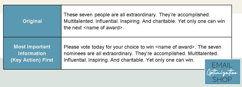
The original version is factually true, but what role do I, the reader, play in all this?
By modifying that last sentence to incorporate the action we want the reader to take, and moving it to the front, we accomplish an inverted pyramid style.
Typically, the most important thing in your email is the action you want the reader to take. So don’t be shy about it – ask the reader to do it right off.
Note: does this mean you can’t ask again, later in the copy! Of course not! You can ask more than once. And yes, ‘Please vote today” should be text link to the landing page where people can vote.
3. Edit Your Copy in to Short, Readable Paragraphs.
Years ago I read a case study done by Microsoft which concluded that paragraphs should be 5-1/4 lines or less to be easily read online. Those are lines, not full sentences. My hypothesis is that shorter paragraphs are easier to skim than long ones – and that most recipients skim the emails they receive.
You be the judge – an example from a promotional email in in my inbox:
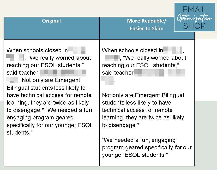
Long paragraphs look like a big block of letters; your eye doesn’t want to read them. Shorter paragraphs allow your eyes to skim and grab some of the words.
4. Personalize Your Copy When You Can
Now, I’m not suggesting being creepy with it. Just because you know the city they live in and their IP address doesn’t mean you should use it.
Email marketing is about building relationships, and calling someone by their name is a way to do that. It’s not difficult – it’s just a custom field that you put in the document which pulls their name from the database (assuming you have their name in your database). So if you have it, use it. Especially if it’s a letter-format email.

Note: If you don’t have names for everyone in your database, use a ‘default’ or a ‘slug’ that will be inserted in those instances.
5. Include Bullet Points to Aid in Readability When Appropriate
White space can really aid with readability in email, and if you have a long list of items there’s an easy way to add white space and readability – bullet points.
Here’s an example from my inbox:
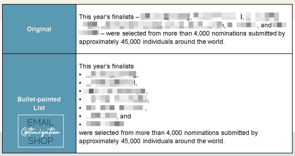
The bullet points make the list skimmable and much easier to read.
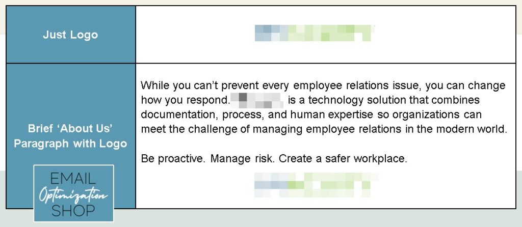
6. Remind People Who You Are and What You Do
One of the mistakes I frequently see companies making is not including a brief description of who they are and what they do in every email they send.
Not everyone who opted-in to receive email from you will remember your company. This brief description doesn’t take much space and it helps your readers know when to seek you out or recommend you. It’s good to keep your company name top-of-mind, it’s better if they know what you do as well.
In Closing
So that’s it. Six simple tips for you to test to improve your email marketing. Give these a try and let me know how it goes. Or call me and let’s discuss how I can help.

Photo by Aaron Burden on Unsplash


