Is a picture worth a thousand words? I hope so! I’ve made this blog post image heavy to quickly allow you to skim these best practices for call-to-action text links and buttons in your email messages. Enjoy!
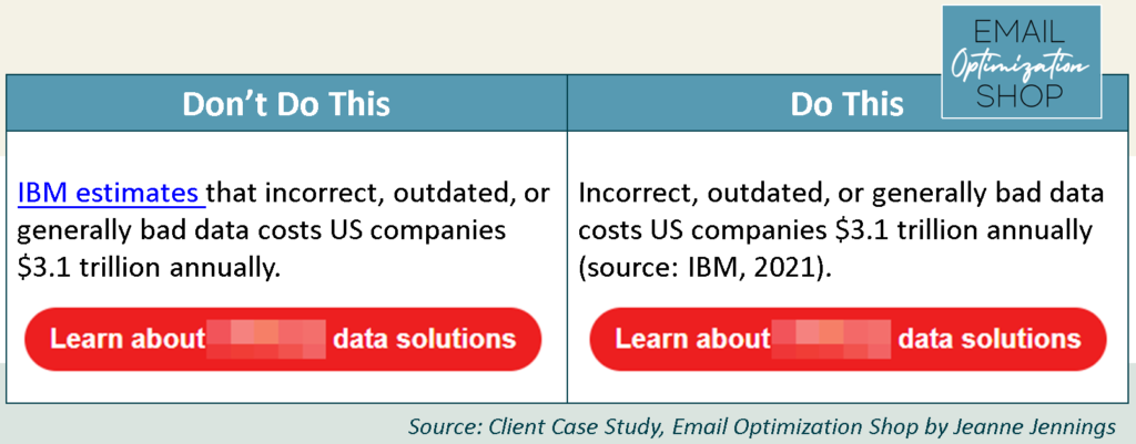
1. Use the visual markers of links sparingly; never on headlines
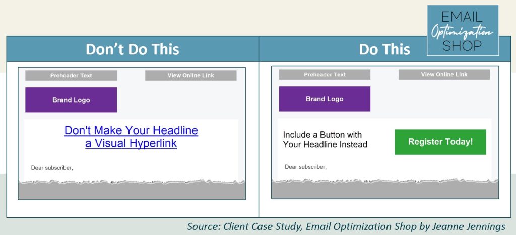
Headlines that are visual hyperlinks look sloppy. Much better to include a button instead – both in terms of looks and in terms of performance (since buttons tend to earn more clicks than text links).
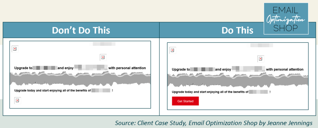
2. Always use bulletproof buttons
A bulletproof button is a cell in a table which has a colored background and rich text copy. Unlike image buttons, it will still be seen if your reader has images blocked.
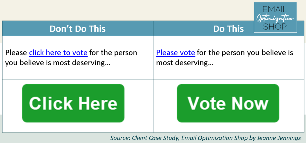
3. You don’t need to tell people to ‘click here’
Back in the mid-1990s we had to tell people to ‘click here’ on hyperlinks because the internet – and this type of functionality – weren’t yet a part of every day life. But now they are – and people know to click (especially if your link is blue and underlined).
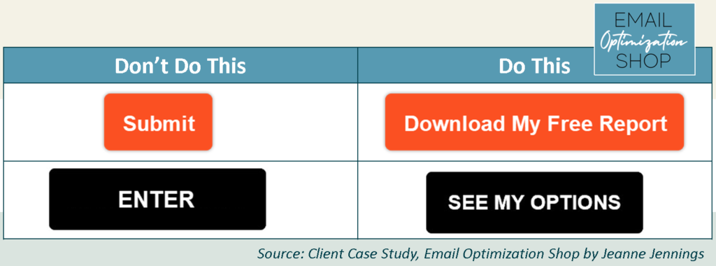
4. Make your text link and button copy benefit-oriented
What’s in it for the reader if they click? Make it clear to drive action. This is true in your email messages – and on your landing pages.
5. Don’t link to things that distract from the action you want the reader to take
Your email should drive path down a path to the action you want them to take. Don’t distract them from this with links that take them off the path.
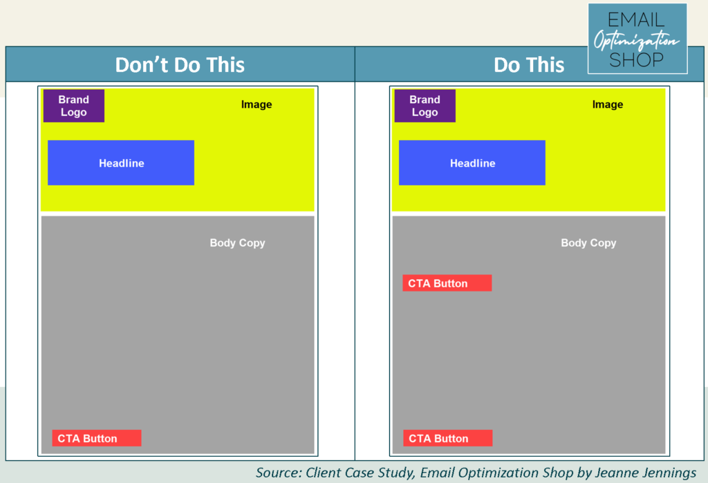
6. Include more than one call-to-action button or link
You never want people to have to scroll to find a link. At a minimum, have a button or link at the top and bottom of your email. If it’s a long email, you will also need one or more in between.
Conclusion
Got it? Great! Give these tips a try with your next email campaign and let me know how it goes!
Feeling overwhelmed? Let’s chat about my helping your email team with these basics, as well as more advanced strategies and tactics, to make your email marketing program more effective and more profitable.
Photo by Waldemar Brandt on Unsplash
