Note: Oops! We got updated conversion information, this campaign had a longer tail than we anticipated, so I’ve updated this blog post accordingly. The results were even better than we initially thought!
Sometimes you can get a big boost from small but thoughtful changes to your creative. Here’s a case study from a recent project we did for a household-name client that resulted in a 95% boost in conversion rate.
Everything we do here at Email Optimization Shop is driven by scientific method. We look at a client’s current control, then come up with hypotheses for things to test to boost performance.
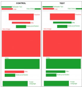
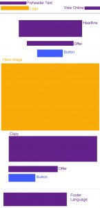
Here’s a colored wireframe of the client’s control email; take a look (if you click on it you can view it larger) — does anything jump out at you?
 There’s a lot to like about this email.
First of all, it’s very clean looking; the white space, for the most part, makes it easy to skim.
They have preheader text, which I’ve found can seriously boost your bottom line performance.
There’s a ‘view online’ link, so that if images are blocked people can click to get a web-based version.
The offer is spelled out clearly and concisely just beneath the headline.
Just below the offer there’s a button to let readers move forward without any further scrolling.
If the reader wasn’t convinced there is additional copy, below the hero image, to motivate them.
And then the offer is reiterated, along with another button to take action.
So all in all, not a bad email.
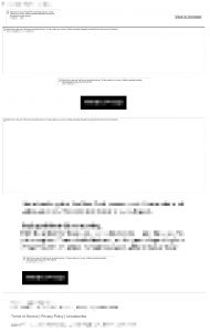
Then we looked at the email with images blocked (below on the right, once again, click to view a larger version).
I blurred out all the identifying copy, to protect the client’s brand.
But as you can see, with images blocked there’s not much to see at the top of the email.
Both the headline and the offer above the hero image are images — so when images are disabled they don’t appear. They do have alt tags (I blurred them out), but those aren’t really enough to grab attention and engage the reader.
And this can be an issue, when 43% of recipients will try to read entire email messages without enabling images (source: Litmus, 2014). Yes it’s an old study. But in my experience it’s still relevant today.
The solution to this is to use rich text – which the client has done here for the preheader, the view online link, the copy beneath the hero image and the footer language. Rich text can be seen even when images are blocked.
The client did use bullet-proof buttons (where a rich text call-to-action appears in a colored cell, to give the appearance of a button which can be seen even if images are disabled) top and bottom, which is good.
But the offer, which is critical to the sale, appears as an image again above the bottom button — meaning it’s not seen when images are blocked.
We had a number of different hypotheses, but the client wanted to focus one test solely on the image blocking question, to get a clean read on whether or not that was depressing response. So…
Here are wireframes for the original (control) and the rich text test (test).
One important thing to know about rich text: the recipient must have the font on their computer in order for it be viewed as intended. For this reason, it’s best to use a common font when you’re using rich text, so you can control how it will be seen.
If you use a font that’s not commonly found on people’s computers, then the computer will decide which font it shows the text in. You lose control.
This client was enamored of a proprietary font they were using for the headline and the offer copy, so we compromised. We kept the headline as an image, so that the proprietary font would appear as intended.
But we changed the font for the offer language, both above and below the hero image, to a common font that would render as it is for recipients.
In the wireframe above, the green items are all rich text and will be seen even if images are blocked; the red items will not be seen if images are disabled, as they are images.
With images enabled the emails look exactly the same; but when images are disabled you can only see the offer copy in the test version.
The change was so small that I wasn’t sure we’d see much impact.
But we did. The test version boosted conversion rate by 95% — that means it was nearly double the conversion rate of the control. We also look at the cost per sale for this client (since these campaigns go to third-party rental lists) — and the cost per sale decreased by 50%.
This was true even though the test showed a slightly lower click-through rate than the control (more on that in a future blog post).
95% is a pretty significant boost. But when you look at the very small — and inexpensive — changes we made to achieve it, it’s absolutely amazing. So amazing that the client is now reconsidering the use of their proprietary font for the headline — we think we can boost the conversion rate even more if that can be read when images are blocked.
So if you aren’t looking at your email messages with images disabled, now’s the time to start. And if you have copy that’s embedded in images, test making it rich text and see if you can get your conversion up. Let me know how it goes!
